
Your logo shows up everywhere, on uniforms, business cards, truck wraps, and every shirt your team wears on the job. It’s the first thing customers notice and the last thing they remember. So what makes a good logo that actually works for your business? After 20+ years of designing logos and printing them on thousands of garments at Dr. Tee’s Design & Screen Printing, we’ve seen what separates forgettable marks from brand identities that stick.
A strong logo isn’t about fancy effects or trendy fonts. It comes down to a handful of proven design principles that ensure your mark looks sharp whether it’s embroidered on a polo, screen printed on a crew shirt, or scaled down to fit a business card. Understanding these principles helps you make smarter decisions when creating a new logo or evaluating whether your current one is doing its job.
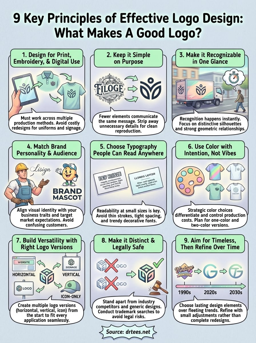
This guide breaks down nine key characteristics that define effective logo design. You’ll learn why simplicity beats complexity, how versatility affects real-world use, and what separates professional branding from amateur attempts. Whether you’re starting a new business or refreshing an existing brand, these principles will give you a clear framework for building a logo that represents your company well across every application.
1. Design for print, embroidery, and digital use
Your logo needs to perform across multiple production methods, not just on a computer screen. A design that looks sharp in Illustrator can fall apart when an embroidery machine tries to stitch fine details or when screen printing reduces it to one or two colors. This principle sits at the foundation of practical logo design because your brand identity lives in the physical world, on uniforms, vehicle graphics, signage, and promotional items where production limitations matter more than visual polish.
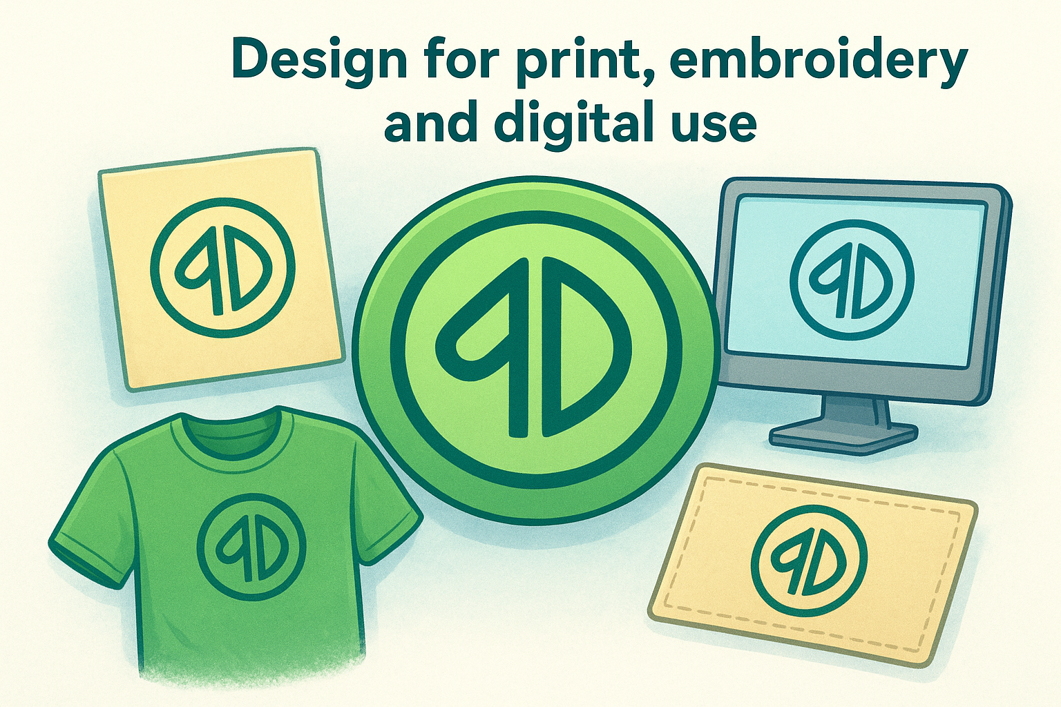
Understanding how different applications affect your logo helps you make choices that work everywhere. When you design with print, embroidery, and digital use in mind from the start, you avoid costly redesigns and ensure your brand looks consistent whether someone sees it on a business card, a shirt, or a website.
Why this principle makes or breaks a logo
A logo that only works on screen forces you into constant compromises. You’ll find yourself asking printers to “do their best” with intricate details, accepting inferior versions on embroidered polos, or paying extra for specialty printing techniques that most competitors handle with standard processes. This creates inconsistent branding across touchpoints and inflates production costs for every order.
Physical production reveals flaws that digital mockups hide. Embroidery machines can’t reproduce hairline strokes or tiny gaps between elements. Screen printing requires adequate spacing between colors and simplified detail levels. When your logo accounts for these constraints, you gain flexibility and cost efficiency while maintaining professional appearance across all applications.
A logo designed for physical production from the start saves money and looks consistent everywhere it appears.
What to check before you finalize the design
Test your logo at actual production sizes before committing to it. Scale it down to one inch wide, the typical size for embroidered left chest placements on polo shirts. Check if all details remain clear and recognizable. If elements blur together or thin lines disappear, you need to simplify the design.
Convert your logo to one-color and two-color versions during the design phase. Many print applications require this, and you shouldn’t discover problems after you’ve already invested in the full-color version. Evaluate how well your logo reads when you strip away color gradients, shadows, and photographic elements.
Mistakes that show up on shirts, hats, and signs
Using too many colors creates cost problems and quality issues. Screen printing charges per color, so a six-color logo costs significantly more to produce than a two-color design. Embroidery with excessive thread colors increases production time and the chance of registration errors where colors don’t align properly.
Relying on fine detail or small text guarantees disappointment. Text smaller than 10-12 points typically won’t embroider cleanly. Intricate patterns or thin decorative elements that look elegant on screen turn into muddy blobs when stitched or printed at small sizes. Complex gradients rarely translate well to screen printing, forcing you into digital printing methods that cost more and may not hold up as well through repeated washing.
2. Keep it simple on purpose
Simplicity in logo design isn’t about minimalism as a style choice. It’s a strategic decision that makes your logo work harder across every application. When you strip away unnecessary elements, you create a mark that reproduces cleanly on embroidered shirts, prints clearly at small sizes, and registers instantly with your audience. This principle directly supports what makes a good logo function in real-world conditions where production constraints and viewing distances matter more than artistic complexity.
What simplicity actually means in logo design
Simple logos use fewer elements to communicate the same message. You focus on essential shapes, limit your color palette, and eliminate decorative details that don’t serve a clear purpose. This doesn’t mean your logo looks plain or boring. It means every element earns its place by contributing to recognition or meaning.
A simple logo performs better because it removes obstacles between your brand and your audience.
How to simplify without making it generic
Add distinctive characteristics through shape relationships, unique proportions, or strategic color use instead of piling on details. Consider how your logo’s silhouette differs from competitors in your industry. Test whether your design remains recognizable as a solid shape with all internal details removed. This exercise reveals if your logo depends too heavily on fine elements.
Red flags that signal you overdesigned it
Your logo crosses into overdesigned territory when it requires zooming in to understand what’s happening. Multiple thin lines running parallel, intricate patterns within letterforms, or photographic textures all indicate complexity that will fail in production. If you can’t describe your logo’s main elements in one sentence, you’ve likely added too much.
3. Make it recognizable in one glance
Your audience doesn’t study your logo. They see it for two seconds while driving past your truck, walking by a team member wearing branded gear, or scrolling through a business directory. Recognition happens instantly or not at all, which makes this principle central to what makes a good logo effective in competitive markets. A design that requires careful examination fails at its primary job: creating immediate visual connection between your mark and your business.
How people “read” logos in the real world
Your customers process logos through peripheral vision more often than direct focus. They notice your employee’s uniform while ordering lunch, glance at your vehicle in traffic, or scan event booth displays from across a room. These fleeting exposures mean your logo must communicate identity through shape and form before viewers consciously register details like text or decorative elements.
A logo that works in one glance creates recognition before your audience realizes they’re looking at it.
Ways to build instant recognition with shape
Focus on distinctive silhouettes that differ from typical shapes in your industry. Avoid complex illustrations that collapse into unrecognizable forms at viewing distances beyond ten feet. Use strong geometric relationships between elements so the overall shape creates a memorable pattern. Test your design by converting it to a solid black shape and evaluating whether that silhouette alone suggests your brand.
Quick tests for recognizability
Show your logo to someone for three seconds, then ask them to describe what they saw. If they struggle to recall basic elements or mistake it for another brand, your design lacks immediate impact. Scale your logo down to thumbnail size on your phone and evaluate whether you still identify it quickly. Place it among competitor logos and check if yours stands out through shape alone before color or text register.
4. Match the brand personality and audience
Your logo communicates brand personality before you say a word. A construction company using delicate script fonts sends the wrong message, just as a financial advisor with a playful cartoon mascot undermines trust. Understanding what makes a good logo effective means ensuring your visual identity matches both who you are as a business and who you’re trying to reach. This alignment determines whether your logo attracts qualified customers or creates confusion about what you actually do.
How to define the brand traits your logo must show
List three to five traits that define how you want customers to perceive your business. Do you prioritize reliability, innovation, precision, approachability, or strength? Ask your current customers why they chose you over competitors. Their answers reveal the qualities your logo should reinforce through design choices like color, typography, and composition style.
Your logo should reflect the traits that already make your business valuable to customers.
How industry expectations help and hurt you
Industry standards provide immediate context for viewers. A plumbing company using blue and strong sans-serif fonts meets expectations that signal professionalism and trustworthiness. Breaking these conventions can differentiate you, but only if you replace expected elements with equally clear signals. Ignoring your industry’s visual language entirely confuses potential customers who can’t quickly categorize what you do.
How to avoid “cool” design that attracts the wrong buyers
Design trends appeal to designers, not necessarily to your target customers. A trendy geometric logo might win design awards but alienate the 50-year-old homeowners who need your roofing services. Test design directions with actual customers in your demographic rather than friends or family outside your target market. Their reactions tell you if your logo speaks to buyers who will actually hire you.
5. Choose typography people can read anywhere
Typography determines whether customers can identify your business when they see your logo on a polo shirt from across a parking lot or printed on a business card handed across a desk. Poor font choices create logos that look professional on screen but turn illegible or unprofessional when reproduced at actual production sizes. Understanding what makes a good logo readable requires thinking beyond aesthetic appeal to consider how letterforms perform when embroidered, printed, or viewed from a distance.
What readability means at small sizes
Readability at small sizes depends on font weight and spacing more than style. Thin strokes disappear when embroidered or printed on textured fabrics. Letters that sit too close together blur into unreadable shapes at one inch wide. Test your typography by printing it at actual application sizes, then viewing it from ten feet away. If you squint to make out the letters, your audience won’t read it on branded apparel or signage.
Typography that works at small sizes uses adequate weight and spacing, not decorative complexity.
How to pick a font style that fits your brand
Match font personality to your industry expectations and customer base. Service businesses benefit from clean sans-serif fonts that project reliability and professionalism. Creative businesses can use custom letterforms that add personality while maintaining clarity. Avoid script fonts for company names unless you serve industries like wedding planning or high-end retail where ornate typography meets audience expectations.
Common typography mistakes that kill trust
Using trendy condensed fonts creates production problems and readability issues. Extremely thin or compressed letterforms fail in embroidery and look unprofessional when scaled down. Mixing multiple font styles within your logo suggests amateur design. Choosing decorative fonts that prioritize style over legibility forces you into constant compromises across applications where clear communication matters more than visual flair.
6. Use color with intention, not vibes
Color choices affect production costs, reproduction quality, and how your audience perceives your business. Selecting colors based on personal preference without considering print limitations creates expensive problems when you need your logo on uniforms, vehicles, or promotional items. Strategic color use ensures your logo maintains impact whether printed in full color on a banner or embroidered in two thread colors on a polo shirt.
What color needs to do for your brand
Your color palette needs to differentiate you from competitors while meeting industry expectations. If every landscaping company in your area uses green and brown, adding an unexpected color helps you stand out without confusing customers about your services. Choose colors that reproduce consistently across different materials and lighting conditions. Test how your colors look on both light and dark backgrounds since you’ll encounter both scenarios in real applications.
How to plan for one-color and two-color versions
Design your logo to work in limited color versions from the start. Create a one-color version that maintains all essential elements when reproduced in black or a single spot color. Develop a two-color version that preserves hierarchy and readability. These simplified versions cost less to produce and work better for applications like promotional products where full-color printing adds unnecessary expense.
Planning for one-color and two-color versions during the design phase prevents production limitations from weakening your brand.
How to avoid color choices that print poorly
Skip gradients and color blends that require complex printing techniques or fail entirely in embroidery. Light colors like yellow or light blue disappear on white shirts and require extra ink layers that increase costs. Neon or fluorescent colors rarely match between screen and thread, creating inconsistent results across different production methods.
7. Build versatility with the right logo versions
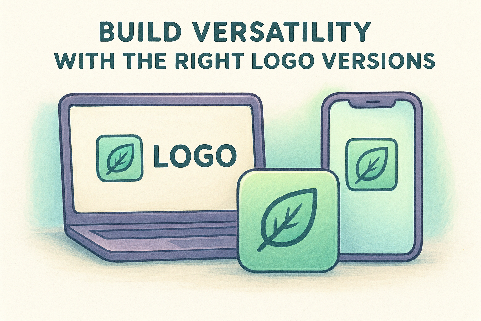
Your logo appears in dozens of contexts where different formats perform better than others. A horizontal layout that looks perfect on your website header won’t fit properly on a square social media profile or a narrow left chest embroidery placement. Creating multiple logo versions from the start prevents awkward cropping, distorted proportions, and inconsistent branding across applications where what makes a good logo depends on having the right format for each use case.
The core logo formats you should have
Your logo system needs at least three primary versions: horizontal, vertical, and icon-only formats. The horizontal version works for website headers, business cards, and wide signage. Your vertical or stacked version fits narrow spaces like building signs, roll-up banners, and promotional items. The icon version appears on social media profiles, app icons, and tight placements like embroidered hat patches where full company names won’t fit legibly.
Having multiple logo versions ready prevents forcing a horizontal logo into square spaces where it becomes illegible.
How to keep your logo consistent across placements
Maintain identical visual elements across all logo versions so viewers recognize them as the same brand. Use the same colors, fonts, and graphic elements whether someone sees your full horizontal logo or simplified icon. Create clear spacing rules that define minimum clear space around your logo. Document these standards in a basic brand guide that ensures employees and vendors apply your logo correctly.
When you need an icon mark, wordmark, or both
Choose an icon mark when your company name is long or difficult to read at small sizes. Service businesses with descriptive names like “Smith Brothers Plumbing and Heating” benefit from simplified icons for tight spaces. Use wordmark-only logos when your business name provides immediate recognition and you operate in industries where decorative symbols look unprofessional or generic.
8. Make it distinct and legally safe
A logo that looks too similar to existing marks creates legal risks and branding confusion. Your customers might mistake you for a competitor, or worse, you could face trademark infringement claims after investing thousands in printed uniforms and signage. Understanding what makes a good logo legally defensible means ensuring your design stands apart from others in your industry while avoiding unintentional copying that creates expensive problems down the road.
How to spot “looks like everyone else” logos
Search your industry category plus the word “logo” and examine the first fifty results. If your design uses the same symbols, layouts, or color combinations as multiple competitors, you’ve created a generic mark that won’t help customers remember you. Look specifically at businesses in your geographic area who might claim you’re copying their established brand. Your logo should feel familiar enough to signal your industry but different enough to own.
A distinct logo avoids symbols, layouts, and color schemes that already saturate your industry.
Where accidental copying happens most often
Stock graphics and icon libraries create the most overlap problems. When you use clip art or icon sets that thousands of other businesses can access, you guarantee similarities with existing logos. Font pairings and layout templates from design platforms often produce nearly identical results across users. These shared resources make accidental duplication almost inevitable.
What to do before you invest in signage and apparel
Run a trademark search through the USPTO database to check for registered marks that match your design concept. Search your state’s business registry for similar names and logos among active companies. This basic research catches obvious conflicts before you commit to production costs. Consider consulting a trademark attorney if you plan significant investment in branded materials or operate in competitive markets where legal disputes cost more than prevention.
9. Aim for timeless, then refine over time
Your logo needs to represent your business for years or decades, not just the current design trend cycle. A mark built on fleeting aesthetics requires costly redesigns that confuse customers and waste money on reprinting uniforms, signage, and marketing materials. Understanding what makes a good logo last means choosing design elements that withstand shifting trends while remaining open to thoughtful refinements that keep your brand relevant without starting over.
How to tell trends from lasting design choices
Trends depend on visual effects that date quickly, like gradients that signal specific eras, decorative flourishes popular for a season, or illustration styles tied to cultural moments. Lasting design uses fundamental shapes and straightforward typography that don’t announce when they were created. Compare logos from companies that have operated for fifty years. The ones that aged well avoided trendy elements and focused on clear communication through form and color.
How to future-proof your logo system
Build your logo using scalable vector formats that adapt to future applications you can’t predict yet. Document your color values in multiple formats so they translate correctly across new printing technologies. Create a basic brand guide that specifies exact fonts, colors, and spacing rules. This foundation lets you apply your logo to new mediums without redesigning from scratch.
A well-documented logo system adapts to new applications without requiring complete redesigns.
When a refresh makes sense instead of a full redesign
Consider refinements when your logo reproduces poorly with current printing methods or looks dated compared to competitors who’ve updated their marks. Small adjustments to typography weight, simplified shapes, or modernized color values maintain recognition while improving functionality. Complete redesigns make sense only when your business fundamentally changes direction or your current logo creates legal or production problems that minor updates can’t fix.
Next steps
You now understand what makes a good logo work across every application your business needs. These nine principles give you a clear framework for evaluating your current logo or creating a new one that performs well on uniforms, signage, vehicles, and promotional materials. A strong logo doesn’t happen by accident. It requires intentional design choices that prioritize versatility, readability, and production requirements over purely aesthetic decisions.
Your next move depends on where you stand with your branding. If you need a new logo designed or want to evaluate whether your current mark meets these standards, review our design process and get a quote to discuss how your logo will translate to printed apparel and promotional items. Working with a team that understands both design principles and production realities ensures your logo looks professional everywhere it appears. Don’t wait until you’ve invested in hundreds of shirts to discover your logo won’t reproduce properly.
