
Your logo shows up on your work trucks, your team’s uniforms, and your business cards. But a logo alone isn’t a brand. Understanding what is brand identity design gives you the foundation to build something that customers recognize and trust.
At Dr. Tee’s Design & Screen Printing, we’ve spent over 20 years helping Kansas City businesses translate their brand vision onto custom apparel. From plumbers needing crew shirts to dental offices ordering embroidered polos, we see firsthand how consistent visual branding separates memorable businesses from the competition. Every shirt, hat, and polo we print becomes part of someone’s brand story.
This guide breaks down the core elements of brand identity design, walks you through the steps to create your own, and shows real-world examples of how it all comes together. Whether you’re starting fresh or refining what you already have, you’ll leave with a clear path forward for building a cohesive brand image.
Brand identity design vs brand image and branding
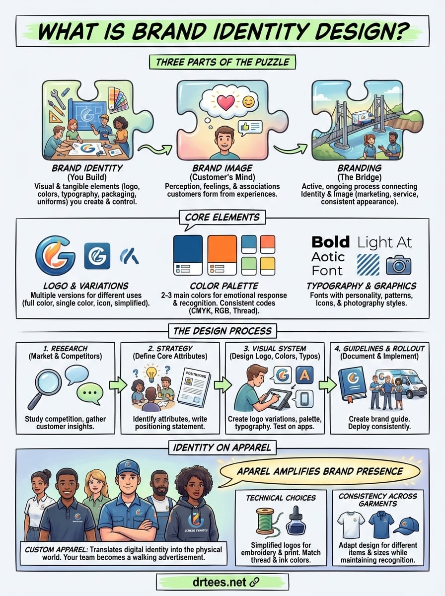
People use these three terms interchangeably, but they describe different parts of the same puzzle. Understanding what is brand identity design requires separating it from brand image and the broader concept of branding. You control brand identity. Your customers create brand image. And branding ties everything together as the ongoing work that connects the two.
What brand identity design actually means
Brand identity design refers to the visual and tangible elements you create to represent your business. This includes your logo, color palette, typography, packaging, business cards, website layout, and yes, the uniforms your team wears. You make deliberate choices about these elements to communicate specific qualities about your company.
Think of it as the outfit your business wears every day. A roofing company choosing bold reds and blacks for their crew shirts sends a different message than one using soft blues and grays. You design these elements with intention, and they stay consistent across every touchpoint where customers encounter your business.
Brand identity is what you build. It’s the controlled, strategic side of your visual presence.
How brand image differs from identity
Brand image lives in your customer’s mind, not in your design files. It’s the perception, feelings, and associations people form when they interact with your business. You can design the perfect logo and color scheme, but your brand image depends on customer experiences, word of mouth, online reviews, and a thousand other factors outside your direct control.
Your plumbing company might have designed a brand identity around reliability and professionalism. But if your trucks show up late and your techs leave messy job sites, customers form a brand image that contradicts your intended identity. The gap between what you design and what customers perceive determines whether your branding succeeds or fails.
Where branding fits in the picture
Branding is the active process that bridges identity and image. It’s every decision you make about how your business shows up in the world. This includes marketing campaigns, customer service protocols, social media tone, the way you answer phones, and how your team presents themselves in branded uniforms.
When you order embroidered polo shirts for your dental office staff, that’s a branding decision. The consistent professional appearance reinforces your brand identity while shaping the brand image patients form. You’re actively managing the connection between what you design and what people perceive.
Branding never stops. Markets shift, competitors emerge, and customer expectations evolve. Your brand identity design might stay relatively stable for years, but your branding strategy adapts to maintain relevance. The work shirts you ordered five years ago still carry your logo, but how you use them in your marketing, what events your team wears them to, and how you photograph them for social media all fall under ongoing branding efforts.
Most businesses get stuck because they treat these concepts as the same thing. You design a logo, print some shirts, and assume the work is done. But effective branding requires understanding that your identity design is just the foundation. The real work happens when you consistently deploy those visual elements while monitoring and adapting to the brand image taking shape in your market.
The core elements of brand identity design
Building a brand identity requires more than throwing together a logo and picking your favorite colors. You need specific visual components that work together as a system. Each element serves a purpose, and when combined correctly, they create the recognizable face of your business that shows up on everything from your website to your work uniforms.
Your logo and its variations
Your logo acts as the primary identifier for your business. It’s the mark that appears on your truck decals, embroidered polo shirts, business cards, and invoices. But you need more than one version. A full-color logo works great on white backgrounds, but what happens when you print on dark navy shirts or need a single-color version for embroidery?
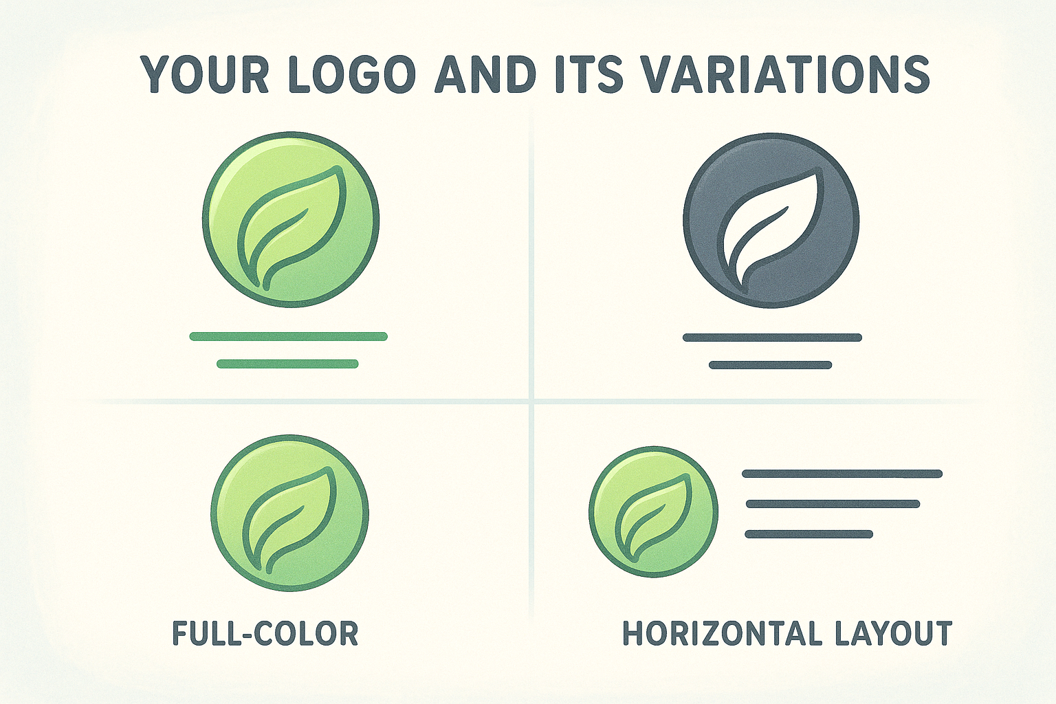
Smart businesses develop multiple logo variations from the start. This includes a full-color version, single-color options in black and white, a simplified icon-only mark for small applications like hat embroidery, and horizontal versus stacked layouts. Your HVAC company’s detailed logo might look sharp on a website, but when you’re printing on the chest of a work shirt, you need a simplified version that reads clearly at that size.
Color palette that drives recognition
Your brand colors do heavy lifting beyond looking attractive. They trigger emotional responses and create instant recognition when customers see your team at job sites. A landscaping company using earth tones communicates something fundamentally different than one using bright, energetic colors.
You need a primary color palette of two to three main colors, plus secondary colors for accent use. Document the exact color specifications for print (CMYK values), screens (RGB or HEX codes), and thread colors for embroidery. This ensures the green on your website matches the green on your crew’s shirts.
Consistency in color application builds recognition faster than any other visual element.
Typography and supporting graphics
The fonts you choose carry personality and tone. A construction company using heavy, bold typefaces sends a different message than a spa using light, elegant fonts. Select two to three fonts maximum: one for headings, one for body text, and optionally one for special applications.
Supporting graphics include patterns, icons, textures, and photographic styles that appear across your materials. These elements create visual interest while maintaining consistency. Your brand might use diagonal stripe patterns, specific icon styles, or a particular way of photographing your team in branded apparel that becomes recognizable over time.
A step-by-step brand identity design process
Creating a brand identity follows a structured approach that moves from strategy to execution. Understanding what is brand identity design means recognizing it’s not a random creative exercise. You need a repeatable process that produces consistent results whether you’re a solo plumber or a 50-person HVAC company. The steps below guide you from blank slate to finished visual system.
Research your market and competitors
Start by studying five to ten competitors in your area. Take screenshots of their websites, note the colors they use on their trucks and uniforms, and identify patterns in how they present themselves. Your roofing company might discover that every competitor uses red, which creates an opportunity to stand out with different colors that still feel professional.
Talk to your existing customers about what matters to them. Ask why they chose your plumbing service over others, what qualities they associate with your business, and how they describe you to friends. These customer insights reveal the gap between your current visual presence and the brand identity you should build. You’re gathering evidence, not opinions.
Define your brand strategy and positioning
Document three to five core attributes that define your business. A landscaping company might choose: reliable, detail-oriented, and environmentally conscious. These aren’t marketing fluff. They become the filter for every design decision. Does this shade of green communicate environmental consciousness? Does this bold typography feel reliable and trustworthy?
Write a positioning statement that captures who you serve and what makes you different. Your HVAC company might position itself as the fast-response specialist for commercial properties, not residential. This strategic clarity prevents you from designing a brand identity that appeals to everyone and connects with no one.
Your brand strategy dictates your visual choices, not the other way around.
Develop your visual system
Design your logo first, creating multiple variations for different applications. Then build out your color palette, selecting two to three primary colors with exact specifications for print and embroidery. Choose typography that reflects your brand attributes from step two.
Test these elements on real applications before finalizing. Mock up your logo on work shirts, trucks, and business cards. Your dental office might love a detailed logo design until you see it embroidered small on a polo chest and realize it needs simplification.
Create guidelines and implement
Document color codes, font names, logo spacing rules, and approved applications in a simple brand guide. This one-page reference sheet ensures consistency when you order new uniforms next year or hire someone to design a flyer. Share it with your screen printing partner so they know exactly what thread colors match your brand.
Roll out your new identity across all touchpoints simultaneously when possible. Order uniforms for your entire crew, update vehicle graphics, refresh business cards, and launch your new website together. Gradual rollouts create confusion where customers see mixed branding that undermines the recognition you’re trying to build.
Examples of brand identity in the real world
Looking at successful brand identities shows you how theory translates into practice. Understanding what is brand identity design becomes clearer when you see real businesses applying these principles consistently. The examples below range from national corporations to local service companies, each demonstrating how visual elements create recognition and trust.
National brands with instantly recognizable identities
UPS built its entire identity around brown and gold. Their delivery trucks, uniforms, packaging, and marketing materials use these colors so consistently that people call their trucks “big brown” without thinking twice. The company trademarked their specific shade of brown, protecting the color association they spent decades building. When you see someone in a brown uniform loading a truck, you know the company before reading any text.
FedEx demonstrates simplicity and hidden meaning in their logo design. The purple and orange color combination stands out in any parking lot, while the white arrow hidden between the E and X communicates speed and precision. Their drivers wear uniforms that reinforce these brand colors, and every touchpoint from envelopes to planes carries the same visual system.
Consistency across every customer touchpoint builds recognition faster than expensive advertising campaigns.
Local businesses executing strong brand identity
Stanley’s Plumbing in Kansas City uses bright yellow trucks and navy uniforms that make their team visible at every job site. The color contrast creates instant recognition when neighbors see the truck parked outside. Their logo appears consistently on shirts, vehicle wraps, and yard signs, with the same simple icon and typography across all applications.
Best Cut Lawn Care built their identity around forest green and white, matching the healthy lawns they promise to deliver. Their crew wears embroidered shirts in these brand colors, creating a professional appearance that differs from competitors using generic apparel. The color choice reinforces their service promise while the consistent uniform presentation builds trust with residential customers.
What separates effective examples from generic branding
These successful brands share three common elements: they commit to specific colors and use them everywhere, they keep their visual systems simple enough to work across all applications, and they maintain consistency over time. Your roofing company doesn’t need a massive budget to achieve the same recognition. You need clear visual standards and the discipline to apply them consistently on trucks, uniforms, signage, and marketing materials.
Notice that none of these examples use complicated logos or trendy design elements. They choose distinctive colors, readable typography, and simple graphics that translate well to embroidered polo shirts or screen printed work uniforms. The power comes from repetition and consistency, not complexity.
Brand identity design for custom apparel brands
Custom apparel takes your brand identity from digital screens into the physical world where customers see and touch it. Understanding what is brand identity design becomes critical when you translate your visual system onto shirts, hats, and uniforms because fabric presents unique challenges and opportunities that websites and business cards don’t. Your team becomes a walking advertisement at every job site, community event, and customer interaction.
How apparel amplifies your brand presence
Every piece of branded apparel you put into circulation extends your reach beyond traditional marketing. Your landscaping crew wearing consistent uniforms creates 40 to 80 brand impressions per day as they work across different neighborhoods. Customers notice the professional appearance before your team knocks on the door, and the visual consistency builds trust faster than any sales pitch.
Apparel also creates brand ambassadors from your employees. When your dental office staff wears embroidered polo shirts with your logo and brand colors, they project competence and unity. Patients subconsciously register the coordinated appearance as a signal of organizational excellence, even if they can’t articulate why they feel more confident in your practice.
Your team’s appearance at customer touchpoints shapes brand perception more powerfully than any website or advertisement.
Technical choices that preserve brand integrity
Translating your logo to embroidered or screen printed garments requires technical adaptations most businesses overlook. Complex logos with fine details or gradients don’t embroider well at small sizes. You need simplified versions that maintain recognition while working within the mechanical limitations of thread and ink. Your detailed brand mark might need a secondary icon version designed specifically for chest placement on shirts.
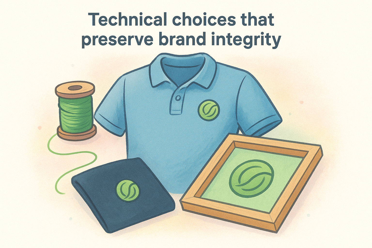
Fabric color selection directly impacts color accuracy for your brand palette. Screen printing white ink on navy shirts produces different results than the same design on black fabric. Thread colors for embroidery come in limited standard options, so you might need to specify custom thread matching to hit your exact brand colors. Work with your printing partner to test samples on actual garment colors before ordering full production runs.
Building consistency across garment types
Your brand identity needs to adapt while staying recognizable across t-shirts, polo shirts, hoodies, and hats. The logo size that works on a sweatshirt chest becomes too large for a baseball cap, requiring specific sizing guidelines in your brand standards. Document these specifications so every order maintains visual consistency regardless of who places it or which garment style you choose.
Consider how different garment qualities reflect your brand positioning. Economy cotton shirts communicate differently than premium tri-blend fabrics. Your HVAC company might use durable work shirts for field crews and embroidered polos for customer-facing staff, both carrying the same brand identity adapted to different functional needs.
Common mistakes and how to avoid them
Most businesses stumble on the same brand identity pitfalls that undermine recognition and waste money on reprints. Understanding what is brand identity design includes knowing where others go wrong so you can sidestep these common errors from the start. The mistakes below show up repeatedly across service businesses, from one-person operations to established companies with decades of history.
Inconsistent application across touchpoints
Your brand identity loses power when customers see different versions of your logo, colors, or messaging at every interaction. One truck displays your old logo while another shows the updated version. Your website uses navy blue, but your crew shirts come in royal blue because someone ordered without checking the brand specifications. These inconsistencies confuse customers and dilute the recognition you’re working to build.
Fix this by creating a simple one-page brand guide that documents your exact logo files, color codes for screen printing and embroidery, and approved applications. Share this document with everyone who touches your branding, from your print shop to your web designer. When you order new uniforms or vehicle graphics, reference this guide to ensure perfect color matching every time.
Overcomplicating your visual system
Complex logos with intricate details or seven-color gradients might look impressive on your computer screen, but they fail when translated to embroidered polo shirts or small business cards. You end up with muddy graphics that don’t read clearly, forcing expensive redesigns or settling for inconsistent simplified versions created on the fly.
Simple, bold designs work harder across all applications than complex graphics that only look good in specific formats.
Choose two to three colors maximum for your primary palette, select clean typography without decorative elements, and design logos that work in single-color versions. Test your identity on actual apparel samples before committing to full production. Your landscaping company’s logo should be recognizable whether it’s embroidered small on a hat or printed large on a truck door.
Ignoring practical limitations
You fall in love with a specific Pantone color that doesn’t exist in standard embroidery thread options, requiring custom thread matching that triples your uniform costs. Your detailed logo requires eight-color screen printing when a simpler version would need only two colors at half the price. These oversights add expense to every order and create barriers to maintaining consistency.
Work with your apparel partner early in the design process to understand thread color availability, screen printing limitations, and fabric behavior. Design your brand identity knowing how it will be produced, not forcing production to match an impractical design. This approach saves money while ensuring your visual system works efficiently across all applications.
Final thoughts
Understanding what is brand identity design gives you the foundation to build visual consistency that turns first-time customers into repeat clients. Your logo, colors, and typography create recognition, but only when you apply them consistently across every touchpoint from work trucks to team uniforms. The businesses that stand out don’t necessarily have the biggest budgets. They commit to a clear visual system and execute it relentlessly.
Your team’s appearance at job sites matters more than most marketing campaigns. When customers see your crew in professional branded apparel, they form instant judgments about your business quality. Every embroidered polo shirt and screen printed work uniform becomes a walking advertisement that builds trust before you speak a word.
Ready to translate your brand identity onto custom apparel that your team will actually wear? See how our design and printing process works to get started with uniforms that reinforce your professional image at every customer interaction.
