
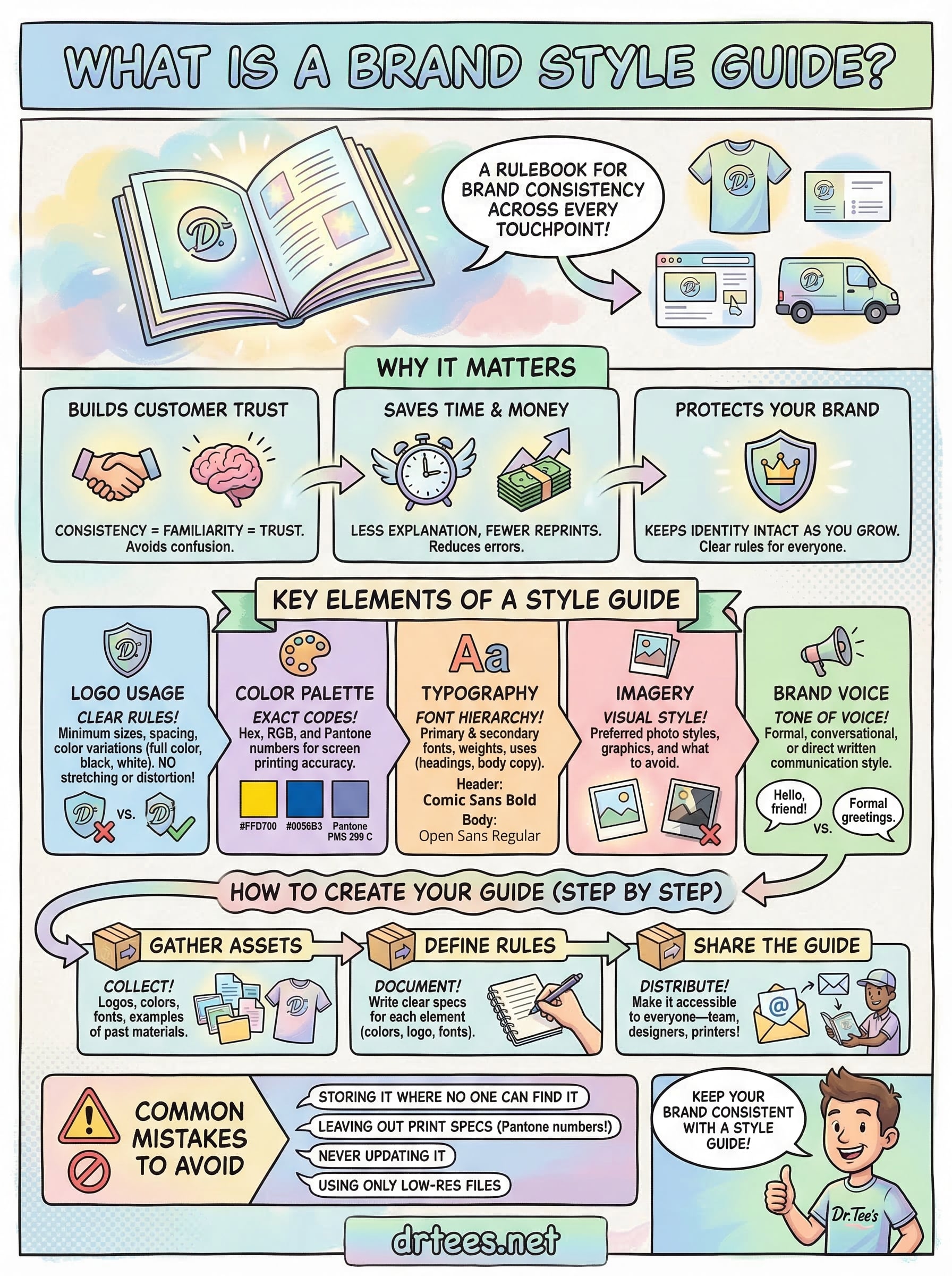
A brand style guide is a document that defines how your brand looks, sounds, and shows up across every touchpoint, from your website to the shirts your crew wears on a job site. It covers your logo usage, color palette, typography, imagery, and voice. Think of it as a rulebook that keeps your brand consistent, whether you’re handing off files to a printer or briefing a new designer.
Here at Dr. Tee’s Design & Screen Printing, we’ve spent over 20 years helping Kansas City businesses put their brand on apparel and promotional materials. One thing we see regularly: businesses that have a style guide get better, more consistent results on their custom screen printing and embroidery orders. The ones that don’t? They end up with mismatched colors, stretched logos, and a brand that looks different on every piece. A style guide prevents all of that.
This article breaks down the purpose of a brand style guide, walks through its key elements, and shows real examples so you can either build your own or improve what you already have. By the end, you’ll know exactly what belongs in a style guide and why it matters for every piece of branded material your business produces.
Why a brand style guide matters
When someone asks what is a brand style guide, the follow-up question is almost always “do I really need one?” The short answer is yes, especially if your brand appears in more than one place. Consistency is what makes a brand recognizable, and recognition is what builds trust with customers over time. Without a style guide, every vendor, employee, or designer who touches your brand is working from memory or guesswork, and that leads to mistakes.
A brand that looks different across every touchpoint doesn’t just look unprofessional, it signals to customers that you’re not paying attention to your own business.
Brand consistency builds customer trust
When your branded apparel, business cards, and website all use the same colors and logo, customers recognize you faster. Recognition builds familiarity, and familiarity is what turns a first-time buyer into a repeat customer. A style guide locks in the visual rules so your brand looks the same whether it appears on a job-site uniform or a printed flyer.
Your customers form an impression of your business in seconds. Inconsistent branding fragments that impression and makes your business look disorganized, even if your actual work is excellent. A style guide gives everyone on your team, and every vendor you work with, the same clear rules to follow from day one.
It saves time and money on every order
Every time you order custom printed shirts, send files to a designer, or brief a new employee, you spend time explaining what your brand looks like. A style guide cuts that explanation time down significantly because everything is already documented. You hand over the guide, and the work gets done correctly the first time.
Reprints and do-overs are expensive. Wrong colors, stretched logos, and off-brand fonts all cost real money to fix after the fact. A style guide prevents those mistakes before they happen by giving printers, embroiderers, and designers a clear reference to work from.
It protects your brand as your business grows
When your business is small, you can manage brand decisions yourself. Once you hire staff, bring on contractors, or expand to new locations, that personal oversight becomes impossible to maintain. A style guide fills that gap and keeps your brand intact even when you’re not in the room making every call.
Vendors like screen printers and embroiderers work with dozens of clients at once. They need clear specifications to deliver accurate results, and a style guide gives them exactly that. At Dr. Tee’s, we consistently see cleaner, faster results when clients come in with a defined color palette, proper logo files, and clear usage rules already documented.
What goes in a brand style guide
Understanding what is a brand style guide is one thing; knowing what actually belongs inside one is another. Most style guides cover five core areas: logo usage, color palette, typography, imagery, and brand voice. Together, these elements give anyone who works on your brand a complete picture of how to represent it correctly across every medium, from a printed flyer to a screen-printed uniform.
Logo usage rules
Your logo section should define how your logo can and cannot be used. That includes minimum size requirements, clear space rules (how much empty space must surround the logo), and approved color variations such as full color, black, and white versions. Incorrect logo usage is one of the most common problems we see on custom apparel orders, and it almost always comes down to not having these rules documented somewhere accessible.
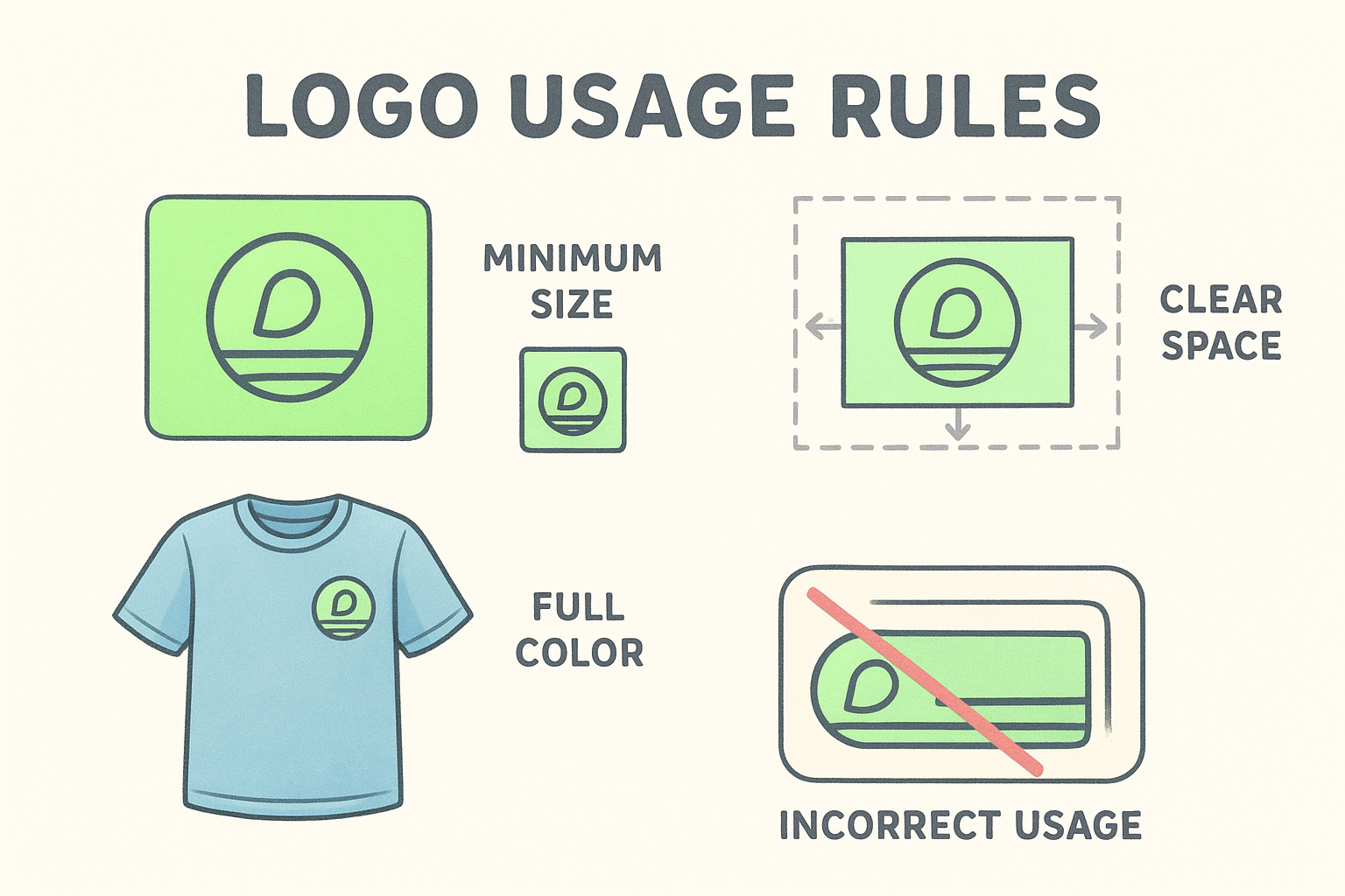
A logo stretched to fill a full chest print or squeezed onto a small left chest pocket looks completely different from the original file, and that difference shows up directly in your brand’s credibility.
Color palette and typography
Color rules should include exact Hex codes, RGB values, and Pantone numbers for every color in your palette. Pantone numbers are especially important for screen printing, where ink needs to be matched precisely to your brand colors. Typography guidelines should list your primary and secondary fonts, their weights, and how each is used across headings, body copy, and captions.
Brand voice and imagery
Your voice guidelines define the tone your brand uses in written communication, whether formal, conversational, or direct. Imagery guidelines cover the style of photos and graphics that represent your brand well, and equally important, the styles and treatments to avoid so your visual identity stays coherent.
Brand style guide vs brand guide vs style guide
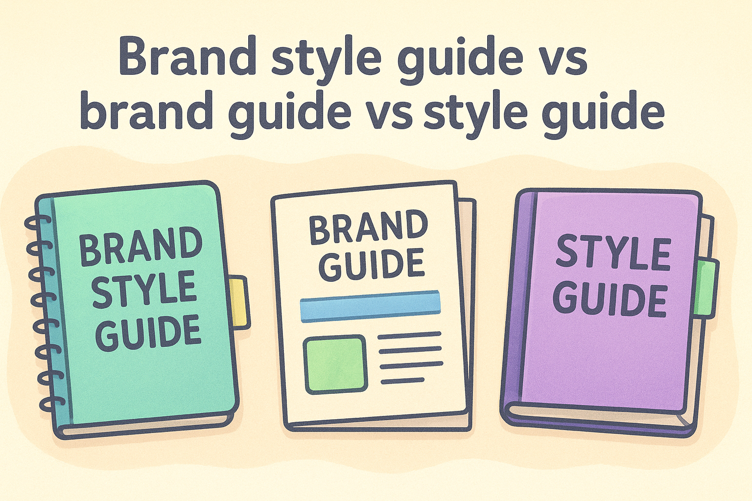
These three terms get used interchangeably, but they don’t mean exactly the same thing. Knowing the difference helps you understand what is a brand style guide and what it’s actually responsible for, so you can build the right document for your business.
What a brand guide covers
A brand guide focuses on the strategic and identity layer of your brand. It defines your mission, values, target audience, and brand personality. Think of it as the “why” behind your brand: who you are, who you serve, and what you stand for. A brand guide rarely includes technical specifications like exact Pantone numbers or font file names, because its job is to communicate strategy, not production details.
A brand guide answers who your brand is, while a brand style guide answers how your brand looks and sounds.
What a style guide covers
A style guide typically focuses on written content and communication standards, such as grammar rules, punctuation preferences, capitalization conventions, and tone of voice. Many large organizations publish their own editorial style guides for internal consistency. A standalone style guide usually doesn’t address visual design elements like logo placement or color codes.
By contrast, a brand style guide combines elements of both: it ties your brand identity to your visual and verbal execution in one document. That combination is what makes it the most practical tool for a business that produces physical branded materials, including custom apparel, signage, and print collateral. When you hand files to a printer, a brand style guide is the only document that gives them everything they need in one place.
How to create a brand style guide step by step
Building a brand style guide doesn’t require a design agency or a large budget. You can build a functional, practical guide by starting with what you already have and adding structure around it. Approaching the process in stages works far better than trying to capture everything at once.
Gather your existing brand assets
Start by collecting every visual element your business currently uses: your logo files, any color codes you have on record, fonts used in past materials, and examples of your brand in use. If you’ve ever printed custom shirts or sent artwork to a vendor, pull those files. Your existing materials reveal patterns, and those patterns are what you document first.
If you can’t find consistent files or colors across your existing materials, that gap is exactly why understanding what is a brand style guide matters so much for your business.
Define the rules and lock in your specifications
Once you have your assets gathered, write clear rules for each element. For colors, record your Hex, RGB, and Pantone values. For your logo, define minimum sizes, approved variations, and clear space requirements. For typography, list your fonts and specify where each one applies across headings, body copy, and printed materials. Keep the language direct and simple so any vendor or new hire can follow the guide without asking follow-up questions.
Share the final guide with every person and vendor who touches your brand, including your screen printer, designer, and internal team. A style guide only works if the people who need it can actually find and use it, so make it easy to access and keep it updated whenever your brand evolves.
Examples and common mistakes to avoid
Understanding what is a brand style guide becomes much clearer when you see how real businesses use them and what happens when they don’t. Strong style guides are specific and actionable, not vague collections of inspiration. Weak ones leave too much open to interpretation, which is exactly where inconsistency creeps in.
What real brand style guides look like
Large brands like Google publish their guidelines publicly, and those documents share a common trait: every rule is specific enough that a designer or printer can act on it without asking follow-up questions. Google’s Material Design system defines exact color values, spacing rules, and typography scales down to fine detail. You don’t need that level of complexity for a small business, but the principle of specificity applies at every scale.
The most useful style guide is the one that answers questions before someone has to ask them.
Mistakes that undermine your brand guide
Several common mistakes reduce the effectiveness of a brand style guide, even when one already exists. Watch for these patterns in your own document:
- Storing the guide where people can’t find it: a guide no one uses is worthless, so keep it in a shared, accessible location.
- Leaving out print specifications: if your guide lacks Pantone numbers, your screen printer is guessing at your colors.
- Never updating it: your brand evolves, and your guide needs to reflect those changes or it becomes outdated fast.
- Using only low-resolution logo files: always include vector files alongside raster versions so vendors can scale your logo without distortion.
Next steps
Now you know what is a brand style guide and why it matters for every branded piece your business produces. A complete style guide protects your brand across every medium, from embroidered polo shirts to printed flyers, and gives every vendor you work with the exact specifications they need to deliver accurate results the first time.
Your next move is simple: gather your existing assets, document your colors, logo rules, typography, and voice, and put it all in one accessible place. Starting with what you already have is enough to build a functional, practical guide that prevents costly mistakes on future print and embroidery orders.
When you’re ready to put your brand on apparel or promotional materials, Dr. Tee’s Design & Screen Printing works with you directly to get every piece right. Sharing your style guide upfront speeds up the process and reduces back-and-forth on approvals. Get a quote for your custom apparel order and see what a clear brand standard can do for your results.
