
You’ve got your logo designed and you’re ready to order custom shirts. But here’s where many first-time customers hit a wall: their artwork file isn’t print-ready. Understanding how to prepare artwork for screen printing saves you time, money, and the frustration of endless back-and-forth revisions with your printer.
At Dr. Tee’s Design & Screen Printing, we’ve spent over 20 years helping Kansas City businesses get their designs onto apparel. We’ve seen every file format mistake, resolution issue, and color separation problem you can imagine. Properly prepared files lead to sharper prints, faster turnarounds, and accurate quotes.
This guide walks you through the technical requirements for screen print-ready artwork, from vector formats and resolution settings to color separations and file types. Whether you’re a business owner preparing your first bulk order or a designer working with a print shop, you’ll have everything you need to submit files that are ready to hit the press.
What your screen printer needs before you export
Before you open your design software, you need specific details from your screen printer. Many designers waste hours preparing files only to discover they used the wrong color mode, incorrect dimensions, or missed critical technical specs. Getting this information upfront ensures you prepare artwork correctly the first time.
Your printer’s production setup determines how you prepare your files. Different shops use different equipment, ink systems, and processes that affect file requirements. Asking these questions before you start will save you multiple revision rounds.
Print specifications to confirm
Start by confirming the exact print area dimensions for your chosen garment. A standard adult t-shirt typically allows a 12″ x 14″ front print, but smaller items like youth shirts or pocket prints have tighter constraints. Your printer should provide the maximum printable area for each location (front, back, sleeve, or pocket).
You also need to know the ink color system your printer uses. Some shops work exclusively with Pantone spot colors, while others can match custom blends or use simulated process printing for complex designs. Understanding their color capabilities and limitations prevents surprises when your final product doesn’t match your screen preview.
Ask your printer for their maximum ink count per design, as this directly impacts your file preparation and final cost.
Technical requirements checklist
Request these specifications from your printer before you begin:
- File format preference (AI, EPS, PDF, or PSD)
- Color mode (spot colors, CMYK, or RGB)
- Resolution requirements for raster elements (typically 300 DPI minimum)
- Bleed and safe zone margins if applicable
- Line weight minimums for fine details (usually 0.5 to 1 point)
- Halftone screen frequency if you’re including gradients or photographic elements
- Output template or mockup file with proper dimensions and guides
Most professional screen printers provide setup templates or spec sheets that include all this information in one document.
Step 1. Set size, placement, and print limits
Your design dimensions must match the physical constraints of both the garment and your printer’s equipment. Many designers create artwork at arbitrary sizes, then discover their design needs to shrink by 30% or more to fit the actual print area. Setting correct dimensions from the start eliminates scaling issues that can distort your artwork or reveal resolution problems.
Establish your print area
You need to work within the maximum printable dimensions for your chosen garment location. A standard adult t-shirt front typically allows 12″ wide by 14″ tall, but youth sizes or smaller garments might only accommodate 10″ by 12″. Create your artwork at the actual print size you intend to use, not larger.
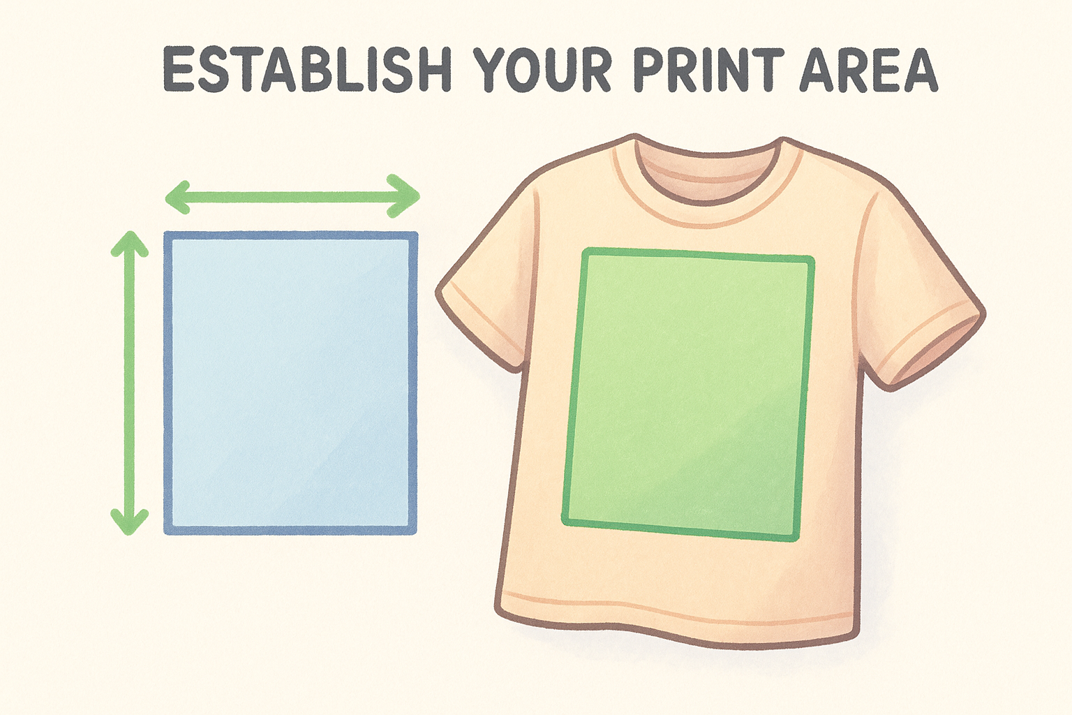
Check the safe print zone within that maximum area. Most printers recommend keeping critical design elements at least 0.5″ to 1″ inside the maximum boundaries to account for garment shifting during printing. If you’re printing near seams, collars, or armholes, you need even more clearance.
Always create your design at 100% of the final print size to avoid quality loss from scaling.
Build your artboard in your design software at these exact dimensions before you start creating. This ensures you see how elements will actually print and prevents unexpected cropping or resizing later.
Step 2. Create clean, print-safe artwork
Screen printing requires artwork simplicity that digital printing doesn’t. Complex gradients, thin lines, and tiny text that look perfect on your monitor can turn into muddy, illegible prints on fabric. Cleaning up your design before you export prevents production problems and ensures your finished shirts match your expectations.
Convert text to outlines
You must convert all text to vector outlines before you submit your files. Fonts can display differently across computers, and missing fonts cause layout disasters when your printer opens your file. Converting text to outlines locks your typography exactly as you designed it.
In Adobe Illustrator, select all text and choose Type > Create Outlines (Ctrl+Shift+O on PC, Cmd+Shift+O on Mac). Save your original editable version separately, because you can’t edit text after you convert it.
Converting text to outlines eliminates font compatibility issues and ensures your typography prints exactly as designed.
Simplify complex elements
Remove unnecessary anchor points and overlapping paths that complicate screen printing. Your design should use solid shapes with clean edges rather than multiple layered effects or transparency blends. Avoid drop shadows, outer glows, and gradients unless your printer specifically supports them in their process.
Keep line weights above 0.5 points minimum, and avoid intricate details smaller than 0.125 inches. These technical constraints ensure your design transfers cleanly to screens and prints clearly on fabric.
Step 3. Assign ink colors and separate the art
Screen printing applies one ink color at a time through individual screens, which means you need to separate your artwork into distinct color layers. Each color in your design requires its own screen, and each screen adds to your production cost. Understanding how to prepare artwork for screen printing means organizing your colors correctly before you submit files.
Match exact ink colors
You need to specify Pantone Matching System (PMS) colors for each element in your design. Instead of using CMYK or RGB values that vary between screens and printers, Pantone spot colors ensure consistent ink mixing that matches your brand standards exactly. Your printer mixes physical inks to match these standardized color codes.
Look up your brand colors in a Pantone color bridge or solid coated guide. If you don’t have established Pantone colors, your printer can match your existing materials or help you select from their standard ink library to reduce setup costs.
Build separated layers
Create a separate layer for each ink color in your design file. Your white t-shirt design with a red logo and blue text needs two layers: one containing all red elements, one with all blue elements. Each layer becomes its own physical screen during production.
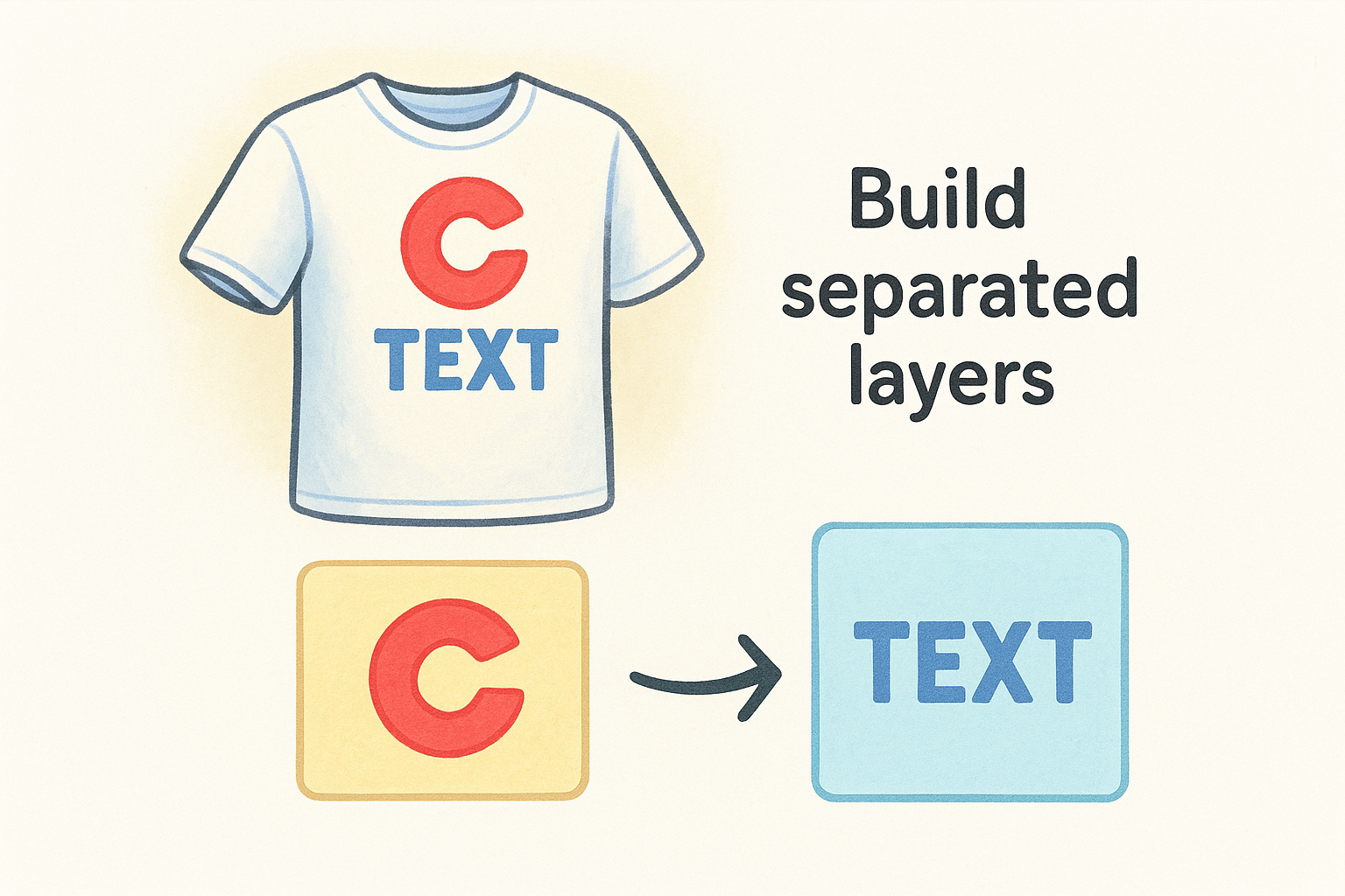
Every additional ink color increases both production time and per-unit cost, so consolidating similar colors saves money.
Remove overlapping objects between colors and flatten transparency within each color layer to prevent unexpected results.
Step 4. Export the right files and preflight them
Your properly separated artwork needs to export in the correct file format with settings that preserve all your preparation work. Exporting incorrectly destroys vector quality or loses your color separations, forcing you to start over. Following the right export process ensures your printer receives files they can use immediately.
Select the proper file format
You should export your design as a vector file whenever possible. Adobe Illustrator (.AI) or Encapsulated PostScript (.EPS) files preserve all your paths, colors, and separations without quality loss. Save your file with fonts converted to outlines and embedded color profiles.
Export at the actual print dimensions you set in Step 1, not scaled versions. Your printer needs files at 100% of the final size to ensure accurate screen creation and registration.
Always export vector files at actual print size to prevent scaling errors that compromise print quality.
Check files before submission
Run through this pre-flight checklist before you send files:
- All text converted to outlines
- Each color separated into distinct layers
- No RGB colors remaining (spot colors only)
- Artboard matches exact print dimensions
- No stray points or hidden objects outside print area
- Stroke weights meet minimum requirements (0.5pt+)
- File saved with a clear, descriptive name
Open your exported file in a fresh program instance to verify it displays correctly without missing elements or font errors.
Quick wrap-up and next steps
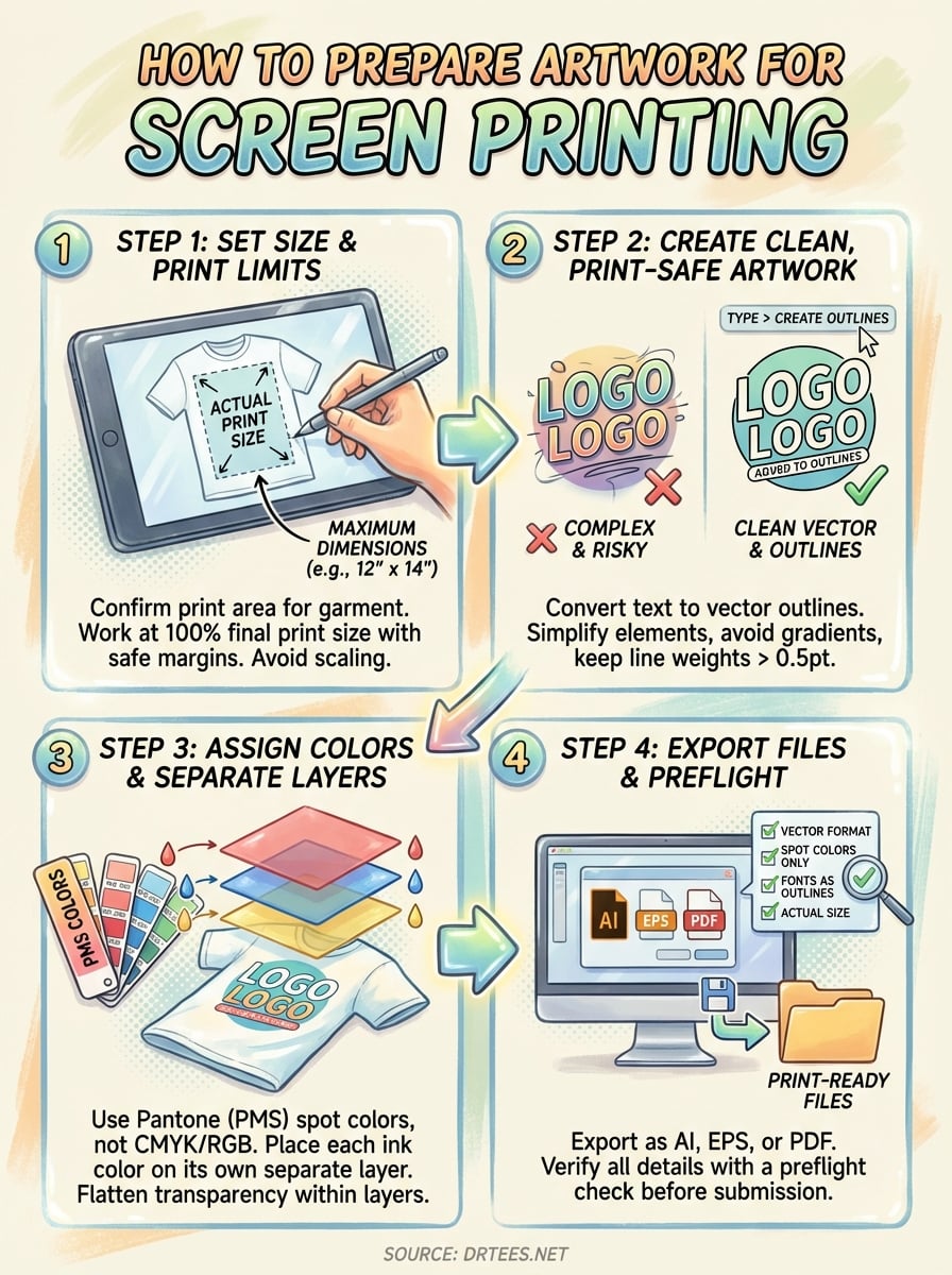
You now understand how to prepare artwork for screen printing through four essential steps: confirming technical specifications upfront, setting correct print dimensions, creating clean vector artwork with proper color separations, and exporting files in the right format. Following these preparation guidelines eliminates costly revision rounds and ensures your printed apparel matches your design vision exactly.
Your success depends on working within technical constraints from the start. Build designs at actual print size with proper margins, convert text to outlines, assign Pantone spot colors, and separate each ink into distinct layers before you export. These steps prevent production delays and give you predictable, professional results on fabric.
If you need professional assistance preparing your design files or want expert guidance on your custom apparel project, start your order with Dr. Tee’s Design & Screen Printing. Our Kansas City team handles file preparation, color matching, and full production with over 20 years of screen printing experience.
