
A great screen-printed shirt starts before ink ever hits fabric. It starts with the design. And whether you’re laying out a logo for your company polos or building artwork for an event tee, understanding graphic design principles makes the difference between something that looks thrown together and something that actually catches eyes. These aren’t abstract art-school concepts, they’re practical rules that sharpen every layout you create.
At Dr. Tee’s Design & Screen Printing, we’ve spent over 20 years helping Kansas City businesses turn rough ideas into clean, print-ready designs. That experience has taught us something: the clients who understand even a handful of these principles communicate their vision faster and end up with results they’re prouder of. You don’t need a design degree. You just need a solid grasp of the fundamentals.
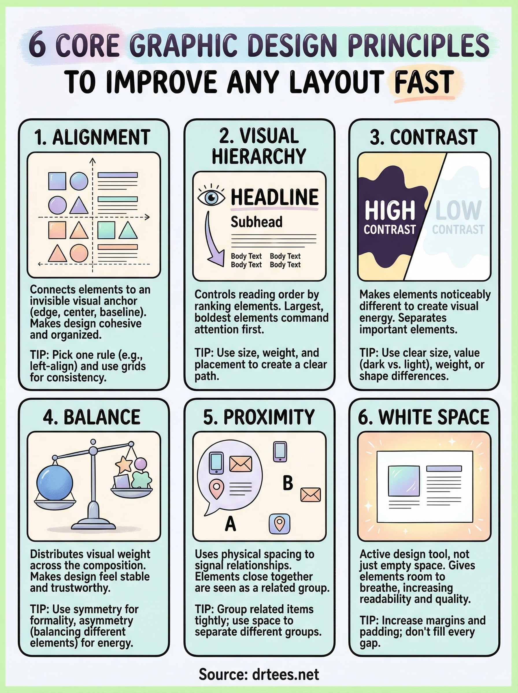
This article breaks down six core principles, balance, contrast, hierarchy, alignment, repetition, and proximity, with straightforward explanations and tips you can apply immediately to any layout. Whether you’re sketching a concept for branded work shirts or mocking up a flyer, these principles will get you to a stronger design, faster.
1. Alignment
Alignment is one of the most immediately visible graphic design principles you can apply to any layout. When elements don’t line up, viewers sense the disorder even before they can name it. A scattered design erodes trust and makes even a good message harder to absorb.
What alignment is and why it fixes messy layouts fast
Alignment means every element in your layout connects to an invisible visual anchor, whether that’s an edge, a center point, or a shared baseline. When you align elements intentionally, the design stops looking like a collection of floating parts and starts reading as a cohesive, organized whole. That shift is immediate and visual, you don’t need to explain it to anyone looking at the work.
Alignment is often the single fastest fix for a layout that looks unfinished or unprofessional.
The quickest ways to align elements without overthinking
Start by picking one alignment rule and applying it consistently across your design: left-align text blocks, center-align headlines, or flush everything to a shared edge. Mixing alignment styles creates visual noise. Most design software includes snapping and alignment tools that lock elements into position automatically, so use those rather than estimating by eye.
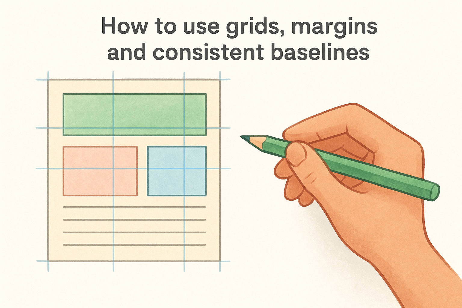
How to use grids, margins, and consistent baselines
A grid gives your layout a repeating structure that keeps spacing predictable across the full composition. Set consistent margins on all sides, then align your text, images, and graphic elements to those grid lines. Baseline alignment keeps your text rows sitting on the same horizontal path, which matters most when two columns of type run side by side.
Where alignment breaks most often in flyers, shirts, and logos
The most frequent alignment failures show up in centered layouts where each line of text is a different width, creating a jagged, uneven staircase effect. On shirts, this often happens when a design block drifts off-center relative to the chest seam. Logos break when the icon and the wordmark sit at slightly different vertical positions, making the whole mark look unbalanced.
A fast alignment check you can do in 30 seconds
Step back from your design and draw a mental vertical line down the left or center of the layout. Count how many elements break that line without a clear reason. If more than one or two elements feel unanchored, realign them to the nearest grid line before moving on to anything else.
2. Visual Hierarchy
Visual hierarchy is one of the most powerful graphic design principles you can apply to any layout. It controls the order in which viewers process information, guiding eyes from the most important element down to the least important.
What hierarchy is and how it controls what people notice first
Hierarchy is the visual ranking of elements in a design. Your viewer’s eye naturally moves to the largest, boldest, or most prominent element first. Every design decision you make either reinforces or breaks that reading order.
The three decisions that create hierarchy quickly
You only need three choices to establish a clear hierarchy: pick a dominant element, a secondary element, and a supporting element. Keep strong contrast between each level so the difference reads as obvious at a glance.
When every element competes for attention at the same volume, nothing stands out.
How to use size, weight, and placement to rank information
Size is the fastest signal your eye reads. Large type commands attention first, and small type naturally recedes. Weight (bold vs. regular) reinforces that ranking, while placement at the top or center of a layout also signals importance to the viewer.
How to build a clear reading path for posters and web sections
Sketch a numbered reading path through your layout before you finalize anything. Your headline should be stop one, your supporting copy stop two, and your call to action stop three. That sequence should feel natural, not something your viewer has to figure out.
Common hierarchy mistakes that make designs feel confusing
The most common mistake is giving too many elements equal visual weight. When your headline, subhead, body copy, and logo all compete at the same size, viewers don’t know where to start and disengage from the design entirely.
3. Contrast
Contrast is one of the graphic design principles that does more work than most people expect. When two elements in your layout look noticeably different from each other, that difference creates visual energy and pulls your viewer’s eye exactly where you want it.
What contrast is beyond color and why it drives clarity
Most designers treat contrast as a color decision alone, but it runs through size, shape, weight, texture, and spacing as well. Strong contrast signals which elements carry the most weight and which ones play a supporting role. Without contrast, a layout flattens into a single undifferentiated field that readers skim past without absorbing anything.
Contrast is what separates a design that gets noticed from one that gets ignored.
The main types of contrast you can use right away
You can build contrast through size differences (large headline against small body copy), value differences (dark elements on light backgrounds), weight (bold type against regular), or shape (geometric forms beside organic ones). Pick two or three types and apply them consistently rather than stacking every option at once.
How to create contrast that stays readable and accessible
Readable contrast means keeping your text and background values far enough apart that viewers can absorb the message without squinting. Aim for a clear, obvious difference in lightness between type and its background, especially on printed materials that may be viewed in varying light conditions.
Contrast moves that work well for apparel graphics and signage
On shirts and signage, bold white type on a dark-colored garment consistently outperforms subtle color-on-color combinations. Keep your ink and fabric values far apart so the design reads clearly at a distance.
Contrast problems to avoid, including low-contrast text
Low-contrast text is the most common readability failure in beginner designs. Gray on white, yellow on white, or light ink on a medium-value fabric all create the same problem: your message disappears before it reaches the viewer.
4. Balance
Balance is one of the graphic design principles that shapes how a layout feels before anyone reads a single word. When a design feels stable and controlled, viewers trust what they’re looking at and spend more time engaging with it.
What balance is and how it changes the “feel” of a design
Every element in your layout carries visual weight, and balance is how you distribute that weight across the composition. A heavy element on one side without anything to offset it makes the whole design feel tense and unresolved.
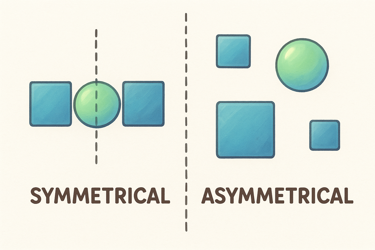
Symmetrical vs asymmetrical balance and when to use each
Symmetrical balance mirrors elements across a central axis and suits formal, authoritative designs like professional logos. Asymmetrical balance offsets different-sized elements at varying distances from center, creating energy that works well for apparel graphics and event layouts.
How to balance visual weight using scale, density, and whitespace
Large elements carry more weight, but dense clusters of small text can offset a single bold image. Use open whitespace on one side to counterbalance a heavy element on the other without crowding in more content.
Balance isn’t just about symmetry; it’s about making your viewer feel settled inside the composition.
Balance tips for layouts with logos, photos, and headlines
When your layout combines a logo, a photo, and a headline, place the heaviest element closest to center and let lighter elements anchor the outer edges. That approach keeps the design visually stable without making it feel rigid or locked down.
The most common balance traps that make designs feel “off”
The most frequent trap is loading one side with multiple heavy elements while leaving the opposite side nearly empty. Your viewer’s eye drifts toward the heavy side and never settles, leaving the design feeling lopsided and unfinished.
5. Proximity
Proximity is one of the graphic design principles that viewers respond to instantly, even when they can’t explain why. When elements sit close together, the eye reads them as a related group. When elements sit farther apart, the eye treats them as separate pieces of information.
What proximity is and how it organizes information instantly
Proximity uses physical spacing to signal relationships between elements without adding any extra words or lines. You don’t need borders or dividers to separate content blocks. Spacing alone does that work when you apply it with intention.
How to group related elements so the message reads correctly
Keep related elements, like a headline and its supporting copy, close enough that a viewer reads them as one unit. Push unrelated elements farther apart to create a visible break. That gap communicates structure more directly than any decorative element.
Spacing rules of thumb for lists, contact blocks, and menus
Tighten the space between items that belong together and increase the space between separate groups. For contact blocks, keep the name, phone number, and address tightly grouped so the reader grabs all three at once.
When spacing is inconsistent, viewers misread your structure and miss key information.
Proximity tips for front and back shirt layouts and event flyers
On shirt layouts, keep your logo and tagline grouped tightly on the chest so they read as one brand statement. On event flyers, group the date, time, and location into a single block with consistent tight spacing between each line.
Mistakes that create accidental groups and mixed messages
The most damaging mistake is placing two unrelated elements too close together, which makes your viewer assume a connection that doesn’t exist. Check every element pair in your layout and ask whether their spacing accurately reflects their relationship before you finalize anything.
6. White Space
White space is one of the graphic design principles that separates polished, professional work from layouts that feel crowded and hard to read. It isn’t empty space you forgot to fill. It’s an active design tool that gives every other element room to breathe and register with your viewer.
What white space is and why it makes designs look expensive
White space is any unoccupied area in your layout, including margins, padding between elements, and the gaps between lines of text. Designs with generous spacing feel deliberate and refined, while designs packed edge-to-edge feel rushed. Restraint signals quality faster than any ornamental detail.
Space is not wasted real estate; it’s what makes everything else in your layout easier to read.
How to add breathing room without losing content
Start by increasing your margins on all sides before cutting any content. In most cases, the layout still carries all the information but reads significantly cleaner. Tightening your line height slightly on body copy also frees up vertical space without removing a single word.
Where to increase padding and spacing for quick readability gains
Focus first on the space around your headlines and the padding inside any button or call-to-action block. Those two areas give you the biggest readability return per adjustment.
White space tactics for print pieces, social posts, and apparel
On apparel, keep your design footprint smaller than you think you need and let the fabric breathe around it. On print pieces, widen your outer margins and increase the gap between each distinct content block.
White space mistakes that cause clutter or awkward emptiness
The most common mistake is filling every open area with extra text, icons, or decorative elements the moment you notice empty space. Awkward emptiness, on the other hand, usually comes from uneven spacing between groups, where one area feels abandoned while another feels packed.
Final Thoughts
These six graphic design principles give you a practical framework you can apply to any layout, whether you’re building a logo, designing a flyer, or putting together artwork for a screen-printed shirt. None of these rules require advanced software or a formal design background. They require attention and a willingness to make deliberate decisions about how your design communicates.
Start with alignment and hierarchy to establish structure, then use contrast, balance, proximity, and white space to refine the details. Applying even two or three of these principles consistently will push your layouts significantly closer to professional quality. The more you practice spotting these elements in designs around you, the faster your own decisions will become.
When you’re ready to bring your concept to life on a shirt, polo, or promotional piece, reach out to Dr. Tee’s Design & Screen Printing and let our experienced team handle the print side while you focus on getting the vision right.
