
If you’ve ever scrolled through Dribbble graphic design inspiration looking for that perfect spark, you already know how powerful a single visual concept can be. Dribbble remains one of the best places to see what top designers are actually creating right now, from bold typography to experimental color palettes that define where branding is headed.
But inspiration only gets you halfway. The real challenge is turning a mood board into something tangible, like a screen-printed design that looks just as sharp on a t-shirt as it does on a screen. That’s where our team at Dr. Tee’s Design & Screen Printing comes in. With over 20 years of graphic design and custom apparel experience in Kansas City, we help businesses bridge the gap between creative vision and finished product.
Below, we’re breaking down five Dribbble-inspired design directions that are shaping brand identity in 2026, and showing you how each one can translate into real-world apparel and promotional pieces. Whether you’re refreshing your company’s look or starting from scratch, these ideas will give you a concrete starting point, not just eye candy.
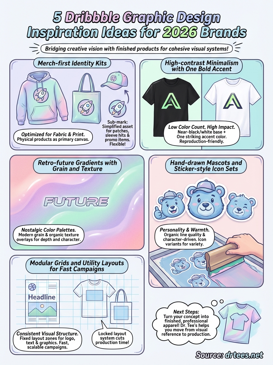
1. Merch-first identity kits
Merch-first identity kits treat physical products as the primary canvas for a brand, not an afterthought. Designers building these systems on Dribbble start with a hoodie or a tote bag before they ever think about a business card, which means every color choice and logo shape is already optimized for fabric and print from day one.
What to search on Dribbble
Search terms like “brand merch kit” or “apparel brand identity” will pull up exactly the kind of system-level thinking you want to study. Look for projects that show the same logo applied across multiple products, such as caps, shirts, and tote bags, because those examples reveal how the designer solved real production constraints within a cohesive visual system. Pay attention to how many colors appear across each item and where the logo sits on each garment.
What to borrow for a 2026 brand system
The strongest merch-first kits in current Dribbble graphic design inspiration feeds rely on two or three core colors and a single primary logomark that holds up at small sizes. Borrow the idea of building a secondary badge or sub-mark, which is a simplified version of your main logo, so you have a flexible asset ready for embroidery patches, sleeve hits, and promotional items without losing brand recognition.
A strong sub-mark does more work than a full logo on most branded apparel because it fits better and reads cleaner from a distance.
How to translate it to screen printing and embroidery
When you bring a merch-first kit to production, your color count directly controls cost, so locking in two or three PMS-matched ink colors early keeps pricing predictable across large and small runs. At Dr. Tee’s, we can match your exact brand colors using custom ink mixing and apply your primary mark or sub-mark across everything from polo shirts to tote bags with consistent, professional results.
2. High-contrast minimalism with one bold accent
High-contrast minimalism pairs a near-black or pure white base with a single accent color that hits hard. Electric yellow, signal red, and saturated teal are popular choices right now. This approach strips away visual noise so your brand mark and core message do all the work, making it one of the most reproduction-friendly styles you can choose for apparel.
What to search on Dribbble
Search “minimal brand identity” or “high contrast logo” on Dribbble to find strong examples of this style. The best shots show a logomark on both light and dark backgrounds, giving you a clear view of how the single accent color carries the brand across different contexts without extra complexity.
What to borrow for a 2026 brand system
The key move is picking one accent color and protecting it. Every strong piece of dribbble graphic design inspiration in this category works because the designer never dilutes the accent with a second competing hue, keeping the visual punch intact everywhere the brand appears.
One accent color used consistently does more for brand recognition than three colors used loosely.
How to translate it to screen printing and embroidery
This style is a screen printer’s favorite because the low color count keeps costs down while the contrast keeps your logo visible from across a room. At Dr. Tee’s, a two-color print run on a dark or light garment delivers exactly this effect at every order size.
3. Retro-future gradients with grain and texture
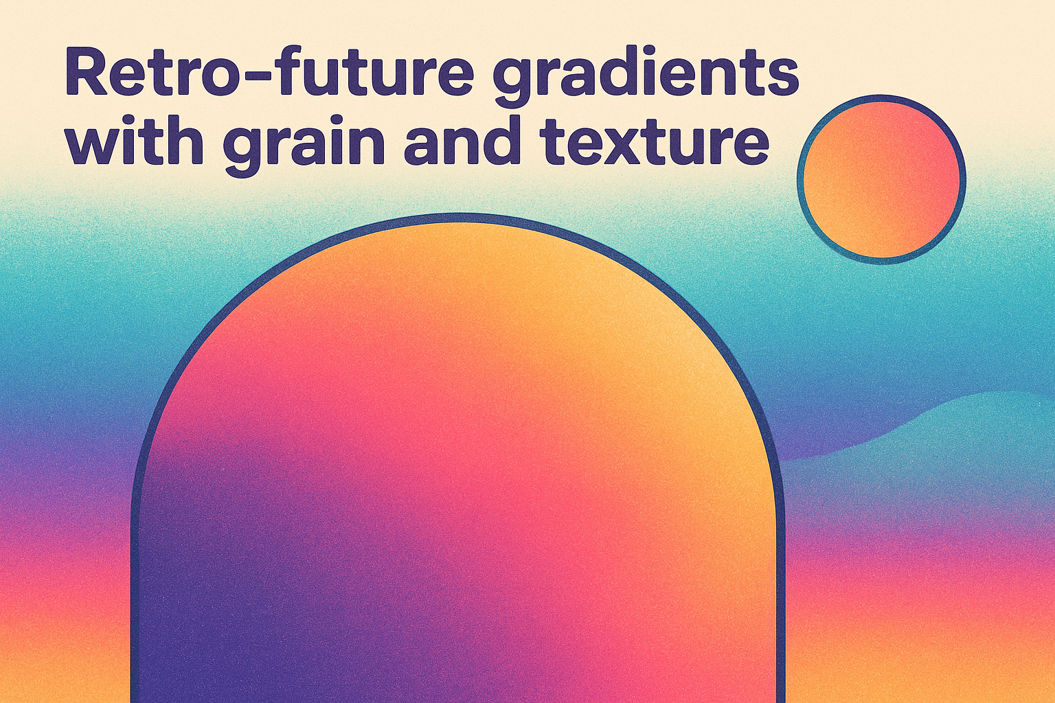
Retro-future gradients blend nostalgic color palettes from the 80s and 90s with modern grain and texture overlays that feel tactile and organic. The result is a style that looks both familiar and forward-thinking, which is exactly why it’s dominating current dribbble graphic design inspiration feeds heading into 2026.
What to search on Dribbble
Search “retro gradient brand” or “grainy texture logo” to find strong examples of this trend. Focus on shots where the designer shows the mark on a plain background alongside the textured version, because that comparison reveals how the grain layer adds depth and character without muddying the core design.
What to borrow for a 2026 brand system
Borrow the two or three-color gradient range and the noise overlay as a consistent finishing move across every brand touchpoint. Apply the grain at the same intensity each time so the texture reads as intentional and owned, not accidental.
Grain texture is what separates a retro-future design from a flat one, so apply it with the same discipline you use for your logo colors.
How to translate it to screen printing and embroidery
Gradients require halftone conversion before going to a screen printer, which your designer handles in the file prep stage. At Dr. Tee’s, we can reproduce that faded, textured look using spot color halftones that hold the retro-future feel across any garment style.
4. Hand-drawn mascots and sticker-style icon sets
Hand-drawn mascots and sticker-style icon sets bring personality and warmth to a brand identity in ways that clean vector logos often can’t. This style is thriving in current dribbble graphic design inspiration feeds because audiences connect with characters and illustrated marks that feel made by a human hand, not generated by a template.
What to search on Dribbble
Search “mascot logo design” or “sticker icon set” on Dribbble to find strong examples of this style. Look for projects that show the character at multiple sizes and on apparel mockups, because those shots reveal how well the illustration holds detail when scaled down for real production use.
What to borrow for a 2026 brand system
Borrow the idea of building a small set of related icons or expressions around your core mascot so you have variety across different products and campaigns without starting from scratch each time.
A mascot with two or three expression variants gives your brand flexibility without creating inconsistency.
How to translate it to screen printing and embroidery
Hand-drawn styles translate well to screen printing because the organic line quality looks intentional on fabric. At Dr. Tee’s, our design team can refine your illustrated mascot into a print-ready file that holds up cleanly across garment styles and color options.
5. Modular grids and utility layouts for fast campaigns
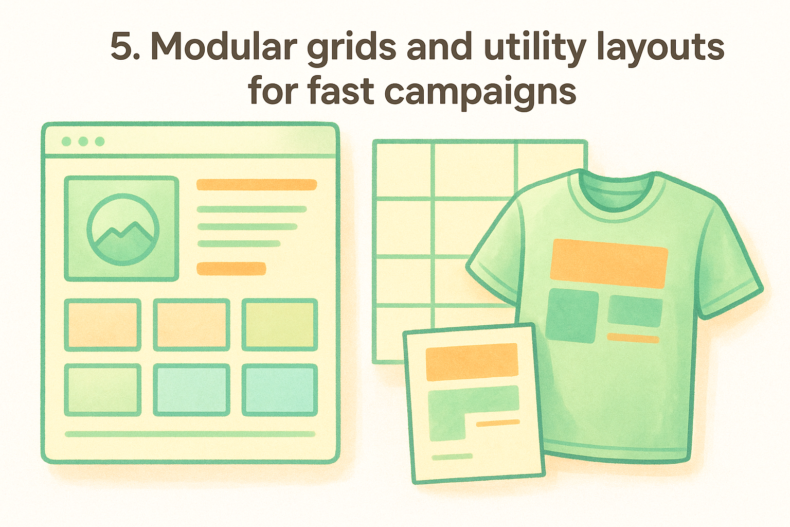
Modular grids divide a design space into equal, repeatable units so you can produce new layouts without rebuilding from scratch each time. Brands running frequent campaigns rely on this system because it gives every piece, from a flyer to a shirt graphic, a consistent visual structure that still allows variety.
What to search on Dribbble
Search “grid system branding” or “utility layout identity” on Dribbble to find strong examples of this approach in current dribbble graphic design inspiration feeds. Look for projects that show multiple campaign pieces side by side, because those examples reveal how a single grid keeps everything visually connected across different formats and sizes.
What to borrow for a 2026 brand system
Borrow the idea of defining a fixed set of layout zones for your logo, text, and graphic elements so every new piece follows the same placement rules. This discipline makes your brand look intentional even when you’re producing work quickly.
A locked layout system cuts production time significantly because every placement decision is already made before the project starts.
How to translate it to screen printing and embroidery
Modular layouts make it straightforward to resize and reposition your design across different garment types without breaking the visual system. At Dr. Tee’s, we apply your grid-based artwork consistently across multiple product styles so your campaign reads as one unified brand from a t-shirt front to a polo chest.
Next Steps
All five of these dribbble graphic design inspiration trends share one practical advantage: they translate directly into real apparel and promotional pieces without losing what makes them work on screen. Whether you land on a merch-first identity kit or a high-contrast minimal mark, the key is moving from visual reference to production before the concept loses momentum.
Your next move is putting a real design in front of a skilled printer who understands both the creative and the technical sides of the process. At Dr. Tee’s, we’ve spent over 20 years helping Kansas City businesses turn brand concepts into finished, professional apparel that holds up wash after wash and represents your brand consistently every time someone wears it. You bring the direction, and we handle everything from initial file prep to quality-checked final products.
Start your project with Dr. Tee’s and see how quickly a well-built brand concept becomes something you can actually put on your team.
