
A strong logo is the foundation of every branded t-shirt, embroidered polo, or promotional item we produce at Dr. Tee’s Design & Screen Printing. Before ink hits fabric, the design has to be right, and that starts with inspiration. Browsing Behance logo design portfolios is one of the most effective ways to see what’s working in brand identity right now, straight from the designers doing the work.
Behance, Adobe’s portfolio platform, hosts thousands of professional designers who share their full creative process, from initial sketches to final logo deliverables. For business owners in Kansas City and beyond who need a logo that looks sharp on a screen and holds up on a screen-printed work shirt, these portfolios offer real-world reference points.
We’ve pulled together five Behance portfolios worth your time. Each one brings a different design perspective, and any of them could spark the direction for your next logo, whether you’re starting from scratch or ready to refresh your brand before your next apparel order.
1. Dr. Tee’s Design & Screen Printing
Dr. Tee’s brings over 20 years of design experience directly to the apparel printing process. Unlike a pure digital portfolio, this work is built around logos that must function in the real world on fabric, thread, and promotional materials. That context shapes every design decision.
What you’ll get from this portfolio style
You’ll see logo concepts built for production, not just screen display. Dr. Tee’s work covers everything from bold single-color marks for trade uniforms to multi-color designs suited for premium embroidered polos. Each project reflects real client needs across industries like construction, healthcare, and local retail.
A logo built for print from the start saves you time, money, and revisions down the line.
Best fit for brands that need apparel-ready logos
This portfolio style works best if you run a service-based business and need branded workwear that communicates professionalism at a glance. Think plumbing companies, landscaping crews, or real estate offices that want a consistent look across shirts, hats, and bags. The designs here are grounded in practical brand identity rather than abstract concepts.
What to look for in a logo that prints cleanly
When you study these designs, pay attention to line weight and color separation. Logos that print cleanly on fabric typically use bold outlines, limited color palettes, and avoid thin strokes that blur during screen printing. You should also check how a logo holds up at small embroidery sizes, where fine detail disappears quickly.
How to turn inspiration into print-ready artwork
Once you find a direction you like, the next step is translating that inspiration into a production-ready file. Dr. Tee’s offers full graphic design services that take your idea, reference image, or rough sketch and build it into a vector file that works across every print method. You don’t need to arrive with a finished design. Bringing a clear sense of direction is enough to get started.
2. Behance Logo gallery
The Behance Logo gallery collects logo work from many designers across industries into one browsable feed. Instead of studying a single portfolio, you get a broad view of current work, which helps when you need to find a design direction quickly.
What makes this gallery useful for fast inspiration
Browsing this gallery lets you cover a lot of ground without committing to a single direction. Searching behance logo design here surfaces projects ranked by appreciation and recency, which naturally filters for higher quality work.
The most appreciated projects reflect what the design community considers strong, well-executed work right now.
Logo styles you can scan for in minutes
Within a short session, you can spot recurring patterns in shape, color, and type. Pay attention to which logo formats appear most in the top results:
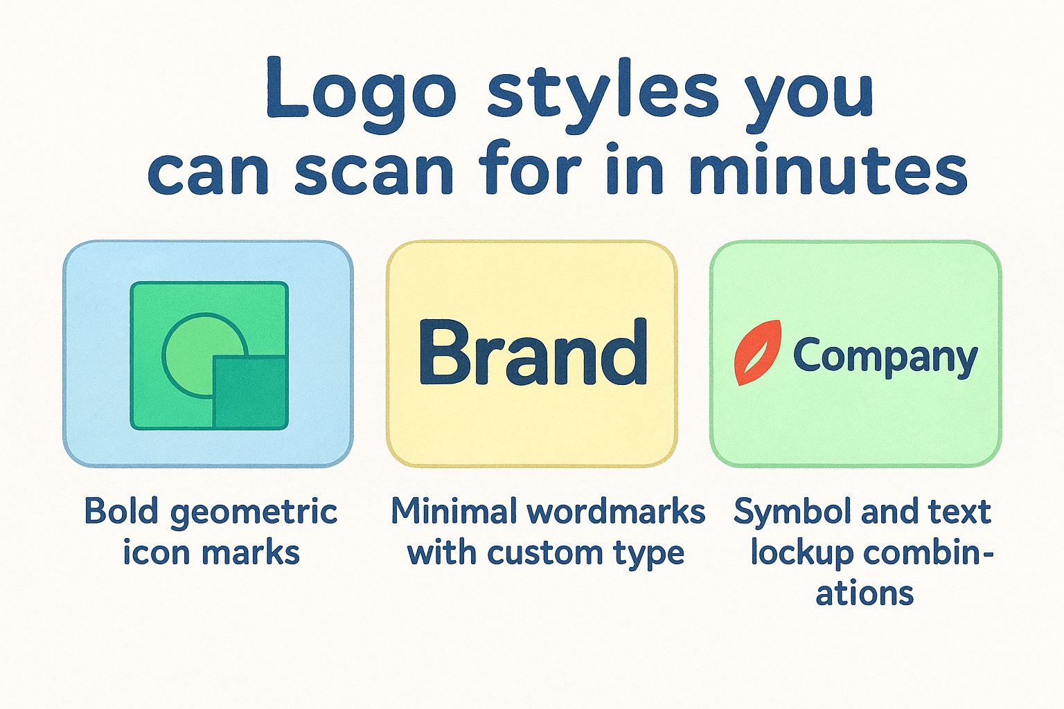
- Bold geometric icon marks
- Minimal wordmarks with custom type
- Symbol and text lockup combinations
What to screenshot and save for your moodboard
Save examples that match your industry’s tone, not only designs you find visually appealing on screen. Your saved images should serve a real purpose.
Each screenshot should help you make a concrete decision about shape, color, or typography when you work with a professional designer.
How to find the creator behind a style you like
Every project links directly to the designer’s full profile. Clicking through often reveals additional logo systems and brand identity work that goes deeper than the single piece that first caught your attention.
Use this to build a short list of designers whose overall style aligns with your brand before you start your own project.
3. LOGOS & MARKS 11
LOGOS & MARKS 11 is a curated logofolio on Behance that groups multiple logo projects into a single, well-organized presentation. It gives you a concentrated look at how one designer approaches mark-making across different client briefs.
What stands out in this logofolio format
The logofolio format presents several logo systems side by side, which makes it easier to compare style consistency and range. You can quickly judge whether a designer works within a single aesthetic or adapts their approach to fit each brand’s individual needs.
When to use bold marks vs clean wordmarks
Bold icon marks carry visual weight that works well on apparel, especially at small sizes on embroidered caps. Clean wordmarks, by contrast, give professional service businesses a polished, text-forward identity that transfers well across business cards and branded polos.
Choosing between a mark and a wordmark often depends on where your logo will appear most frequently.
Composition tricks that improve recognition
Pay attention to how negative space and proportion are handled within each mark. Well-balanced compositions use visual anchoring to make a logo feel stable at any size, which matters when your design moves from a digital mockup to a printed shirt.
How to trace the designer’s other logo work
Every behance logo design project links back to the creator’s full profile. Clicking through reveals additional work that shows how the designer handles different brand categories and real client constraints across industries.
4. Logo Collection 2026, Selected Brand Marks & Logotypes
This behance logo design project pulls together a curated set of brand marks and logotypes completed across the past year. Browsing it gives you a clear picture of where professional brand identity work is heading in 2026.
What you’ll see across modern brand systems
Across this collection, you’ll notice that designers are favoring tight visual systems over standalone marks. Each logo functions as part of a broader brand architecture, which means the mark, the type, and the color palette all support each other rather than competing.
A logo that fits into a system from the start adapts more cleanly to apparel, signage, and digital applications.
Patterns in typography choices that feel current
The collection leans toward geometric sans-serif typefaces with adjusted letter spacing. You’ll also see custom ligatures and modified letterforms used to create distinction within otherwise simple wordmarks.
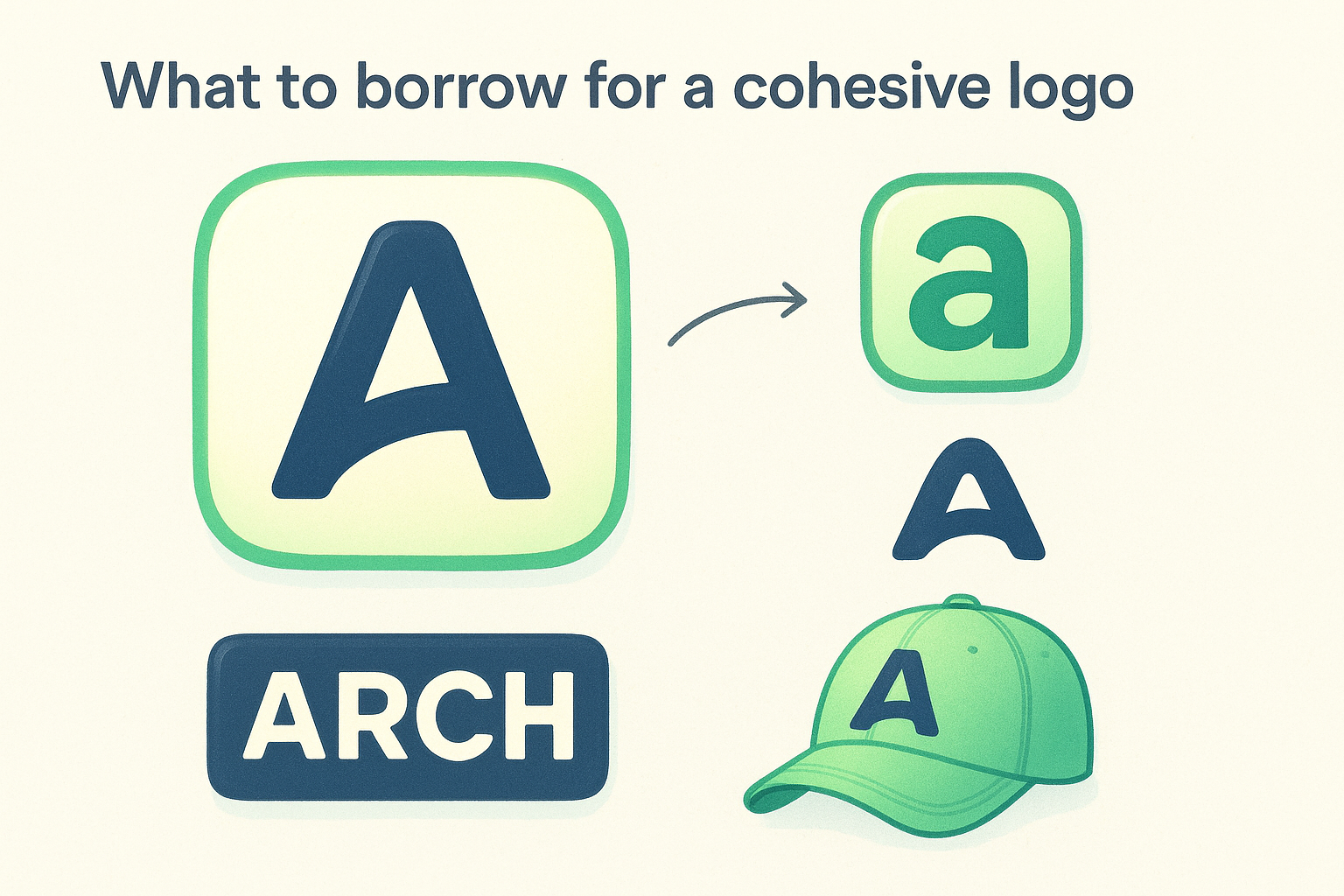
What to borrow for a cohesive logo family
Focus on how secondary marks and submarks are derived from the primary logo. Borrowing this approach means your brand scales from a full lockup on a polo shirt down to a small embroidered cap logo without losing visual continuity.
How to compare variations without copying
Pull two or three examples from the collection and list what each one does with proportion, weight, and spacing. Comparing these specific decisions points you toward your own original direction rather than copying any single design.
5. Logofolio typography and icon design
This behance logo design project combines custom typography and standalone icon work in one portfolio, giving you a direct look at how both elements function together. Studying it alongside the other portfolios here gives you the most complete picture of brand identity before you commit to a direction.
Why this mix helps you build a complete identity
Most brands need both a recognizable icon mark and a legible wordmark to cover every application, from a large banner to a small embroidered chest logo. This portfolio shows how those two elements can share the same visual language without competing.
A logo system that pairs a strong icon with matching type gives your brand flexibility across every surface it appears on.
How type and icons work together in real brands
Notice how the type weight and icon weight match within each project. When they align, the full lockup feels like one unified mark rather than two separate parts placed next to each other.
Details that improve readability at small sizes
Pay close attention to counter space and stroke width in each icon. Tight counters and thin strokes disappear at small embroidery sizes, so studying what holds up in this portfolio helps you spot the same strengths or weaknesses in your own logo.
How to explore related work on Behance faster
Each project profile includes tagged categories and linked series, so clicking through the designer’s other work takes seconds. Use those tags to filter for additional typography-focused or icon-focused projects that match the direction you are building toward.
Next steps
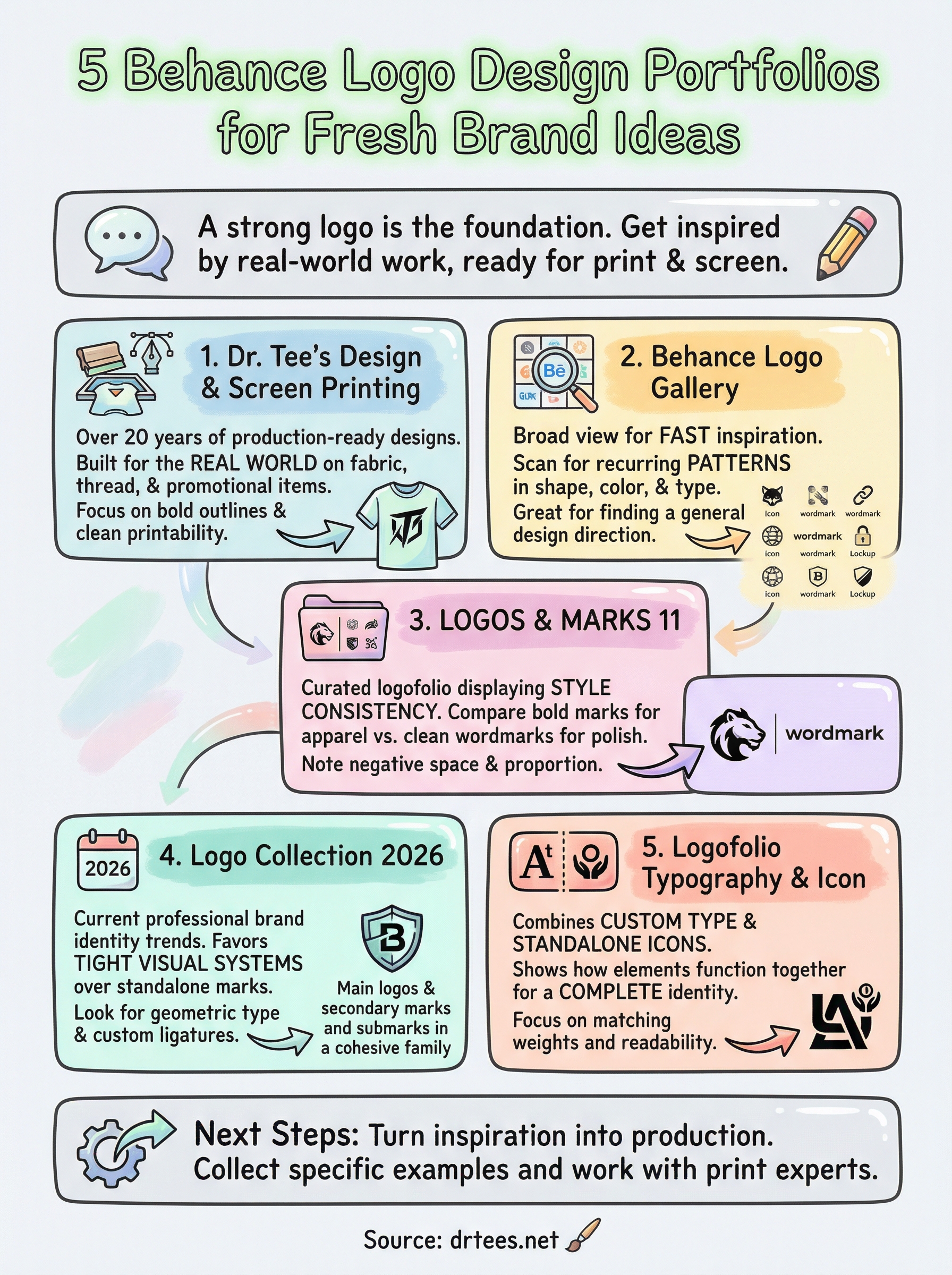
Browsing behance logo design portfolios gives you a real starting point, but inspiration only takes you so far. The gap between a design you admire and a logo your business actually uses comes down to working with someone who understands both the creative and the production side of the process.
Each portfolio in this list reflects a different approach to brand identity. Your job now is to collect two or three specific examples that match your industry, your tone, and the surfaces your logo will live on, whether that is a screen-printed work shirt, an embroidered hat, or a set of business cards.
Once you have a clear direction, Dr. Tee’s can take it from there. With over 20 years of design and print experience, the team builds logos that hold up in production from day one. Start your project with a free quote and bring your reference images along.
