
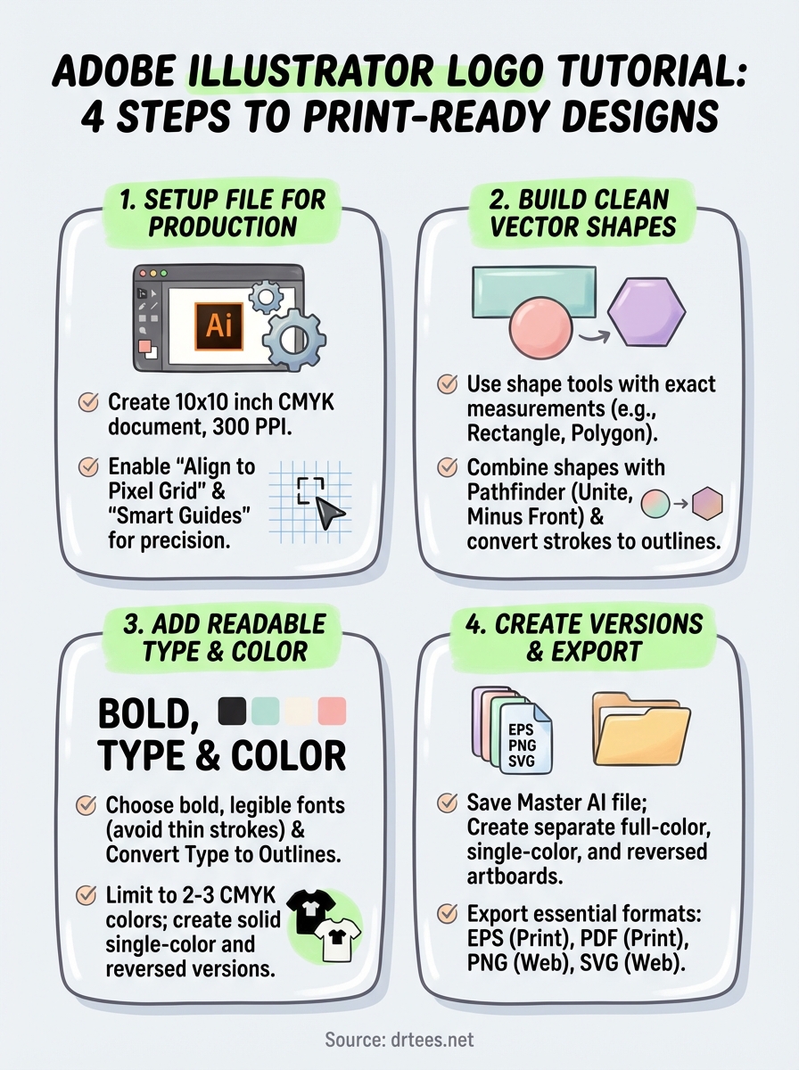
A strong logo is the foundation of any business’s visual identity, and learning to create one yourself puts you in control of your brand from day one. This Adobe Illustrator logo tutorial walks you through the entire process, from opening a new document to exporting a print-ready file you can actually use on shirts, signage, and marketing materials.
At Dr. Tee’s Design & Screen Printing, we’ve spent over 20 years turning logos into screen-printed and embroidered apparel for Kansas City businesses. We know what separates a logo that prints beautifully from one that falls apart on press. That hands-on experience shapes everything in this guide, you’ll learn not just how to design in Illustrator, but how to build a logo that works in the real world.
Whether you’re a trades professional starting a new company or an organization leader refreshing your team’s look, this step-by-step breakdown covers the essential tools, techniques, and decisions beginners need to master. By the end, you’ll have a vector logo ready for production, or at least a solid draft to refine with a professional designer.
What to plan before you open Illustrator
The design decisions you make before touching your mouse determine whether your logo succeeds or fails in production. You need to answer fundamental questions about your brand and how the logo will be used before you start building shapes. Jumping straight into Illustrator without this prep work leads to designs that look fine on screen but break down when printed on a shirt or embroidered on a hat.
Understand your brand needs
Start by defining what your logo needs to communicate. Write down three to five words that describe your business personality, whether that’s professional, rugged, modern, friendly, or technical. A plumbing company logo should feel different from a boutique real estate agency, and those differences need to show up in your shape choices, typeface, and overall tone.
Consider where you’ll use this logo most often. If you run a trades business like roofing or HVAC, your logo needs to work embroidered on polo shirts and printed on truck decals. Medical offices and professional services typically need designs that scale well on business cards and letterhead. Knowing your primary applications helps you avoid overly complex designs that won’t survive the transition from screen to fabric.
Sketch multiple concepts on paper
Grab a pen and sketch at least five different logo directions before you open this adobe illustrator logo tutorial in practice. These don’t need to be polished drawings, just rough thumbnails that explore different visual approaches. Try one with just text, another with an icon, and a third that combines both. Quick sketches let you test ideas in seconds instead of wasting hours building something in Illustrator that doesn’t work.
Look at what other businesses in your industry use, not to copy them, but to understand what’s expected and where you can stand out. If every competitor uses a shield shape, you might choose a circle or hexagon instead. Pay attention to how established brands balance simplicity with personality, you want your logo memorable but not gimmicky.
The best logos are the ones you can draw from memory after seeing them once.
Gather your technical specifications
You need to know your exact brand colors before you start designing. Pick two to three colors maximum for screen printing, and understand that gradients and complex shading add cost and complexity. Write down whether you want your logo to work in a single color, since many applications like embroidery or stamps require one-color versions.
Decide on your sizing requirements early. Your logo should read clearly at one inch wide for embroidered left chest placement and scale up to 12 inches for full front shirt designs. List every place you plan to use this logo: shirts, business cards, vehicle graphics, social media, website headers. Each application has different technical requirements, and planning for all of them now prevents costly redesigns later when you discover your intricate design won’t embroider cleanly.
Step 1. Set up your Illustrator file
Your document settings determine whether your logo exports correctly for print, so you need to configure them properly from the start. Launch Adobe Illustrator and click File > New or use the keyboard shortcut Ctrl+N (Cmd+N on Mac). The New Document dialog box controls your artboard size, color mode, and resolution, all of which affect how your logo performs in production environments like screen printing and embroidery.
Create a new document with the right settings
Name your file something descriptive like “CompanyName_Logo_2026” so you can find it easily later. Set your artboard dimensions to 10 inches by 10 inches, which gives you plenty of workspace to design and test your logo at various sizes. Choose CMYK color mode from the dropdown menu, since this matches how most commercial printers and screen printers process color separations.
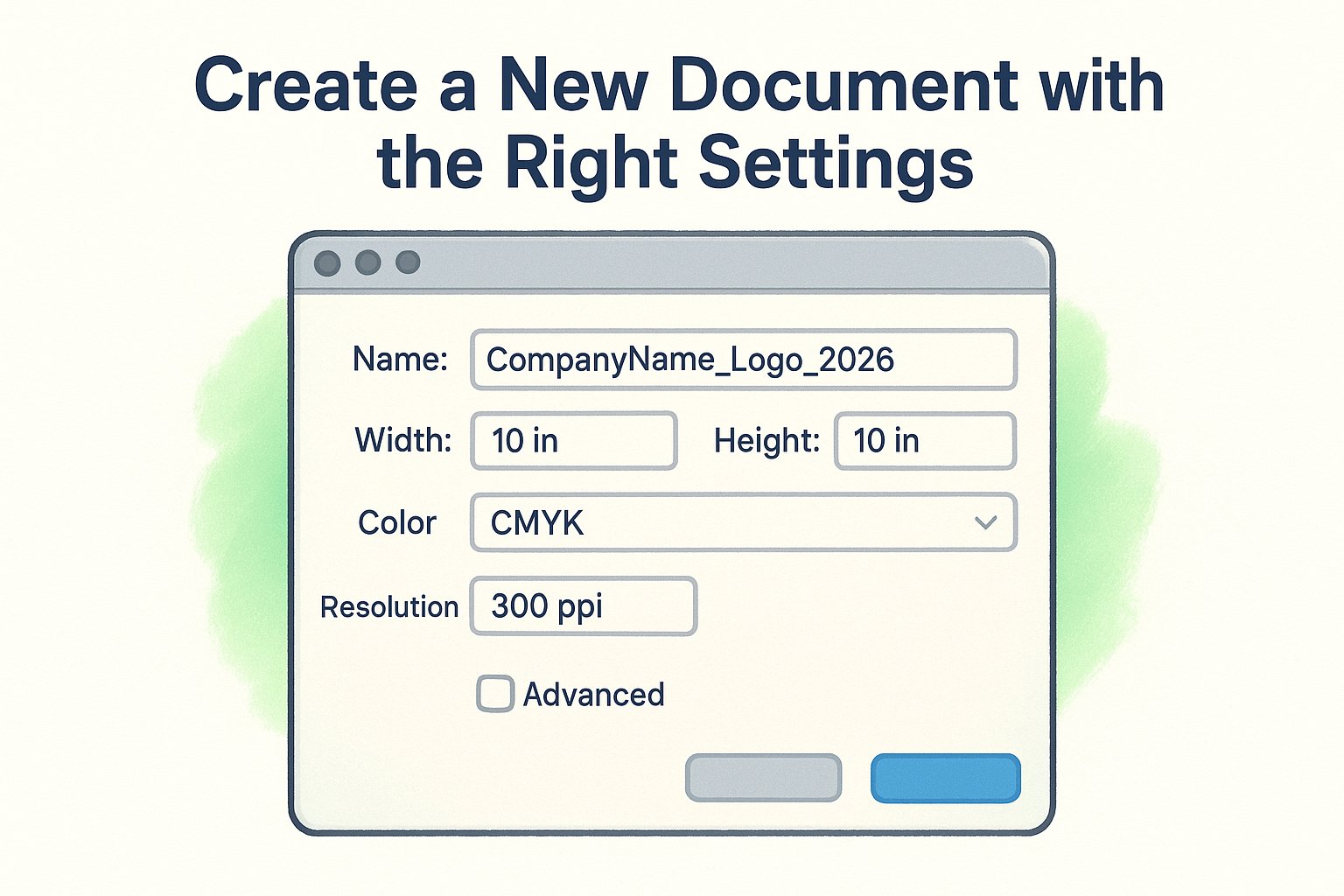
Set your raster effects to 300 PPI even though you’re working with vectors. This resolution matters when you export PNG or JPEG versions of your logo for web use or quick proofs. Under the Advanced options, select Align New Objects to Pixel Grid to prevent fuzzy edges when you export files for digital applications.
Proper document setup prevents file conversion headaches that waste hours when you’re ready to print.
Configure your workspace for logo design
Switch to the Essentials workspace by clicking Window > Workspace > Essentials or selecting it from the workspace switcher in the top right corner. This layout puts your most-used panels (Layers, Color, Swatches, Pathfinder) within easy reach while keeping your artboard visible. You can customize this layout by dragging panels to different positions, but start with Essentials until you understand which tools you reach for most often.
Open the View menu and turn on Smart Guides (Ctrl+U or Cmd+U). These visual helpers snap your shapes to precise angles and alignment points, which keeps your logo elements mathematically aligned instead of eyeballed. Enable the grid by selecting View > Show Grid, then set your grid spacing to 0.25 inches under Edit > Preferences > Guides & Grid. This grid helps you build proportional shapes and maintain consistent spacing between logo elements as you work through this adobe illustrator logo tutorial.
Step 2. Build clean vector shapes
Vector shapes form the foundation of every professional logo because they scale infinitely without losing quality. Select the Rectangle Tool (M) from the left toolbar and click once on your artboard to enter specific dimensions instead of dragging freehand. This method gives you mathematically precise shapes that align perfectly and reproduce consistently across every application, from business cards to billboard-sized vehicle wraps.
Use basic shape tools effectively
Click and hold the Rectangle Tool to reveal the hidden shape menu: Rounded Rectangle, Ellipse, Polygon, and Star tools. Each tool lets you input exact measurements by clicking once on the artboard instead of drawing by eye. For a hexagon logo mark, select the Polygon Tool, click your artboard, enter 6 sides and your desired radius, then click OK. You get a perfect geometric shape every time instead of an irregular blob that looks amateur.
Hold Shift while dragging any shape tool to constrain proportions, which keeps circles perfectly round and squares perfectly square. This keyboard modifier prevents the accidental ovals and rectangles that plague beginner designs. Press Alt (Option on Mac) while dragging to draw shapes from their center point outward, which helps you position elements symmetrically around a central axis.
Combine shapes with Pathfinder
Open the Pathfinder panel from Window > Pathfinder or Shift+Ctrl+F9 (Shift+Cmd+F9 on Mac). Draw two overlapping circles, select both with the Selection Tool (V), then click Unite in the Pathfinder panel to merge them into one compound shape. The Shape Modes in the top row (Unite, Minus Front, Intersect, Exclude) let you build complex forms from simple geometry without hand-drawing every curve.
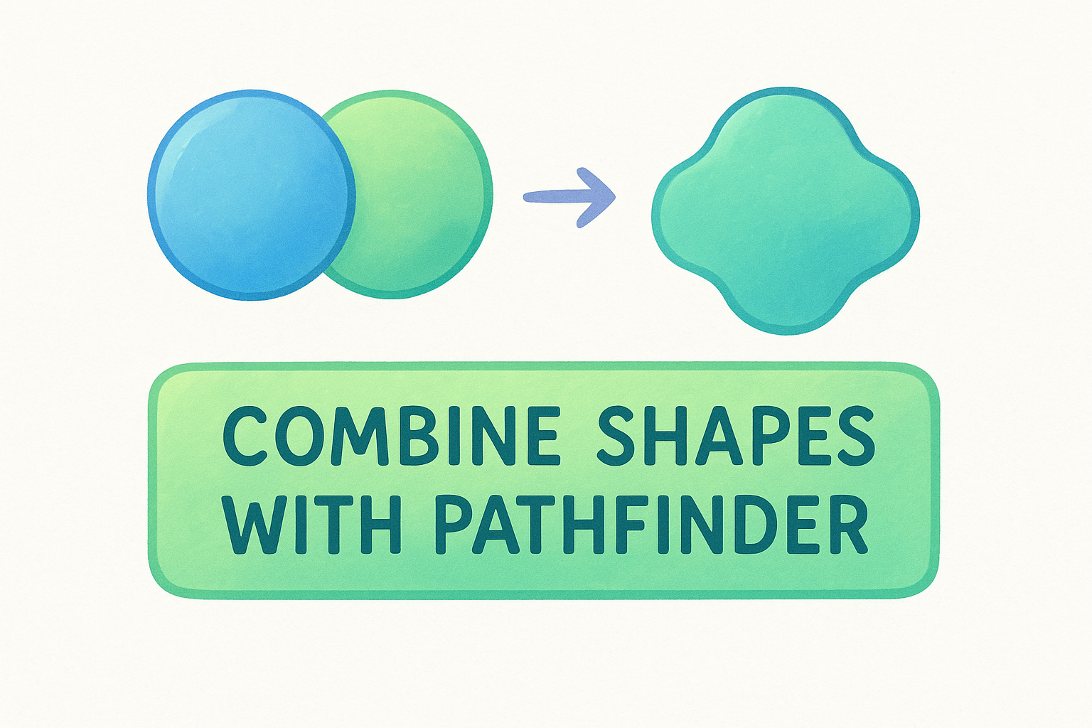
Clean geometric construction makes logos easier to reproduce accurately across different production methods.
Here’s how each Pathfinder mode works in practice:
- Unite: Combines all selected shapes into one merged object
- Minus Front: Cuts the top shape out of the bottom shape
- Intersect: Keeps only the overlapping areas of selected shapes
- Exclude: Removes overlapping areas and keeps the rest
Keep stroke weights consistent
Click any shape and look at the Stroke panel (Window > Stroke). Set your stroke weight to 2 points or 3 points and use that same weight throughout your entire logo. Inconsistent line weights look sloppy and create production problems when you separate colors for screen printing. Choose round caps and round joins in the Stroke panel to prevent sharp points that break down during embroidery digitization.
Convert all strokes to filled shapes before you export by selecting Object > Path > Outline Stroke. This conversion prevents line weight scaling issues when printers resize your logo and guarantees your design prints exactly as intended at any size during this adobe illustrator logo tutorial workflow.
Step 3. Add type and color that print well
Typography and color choices separate amateur logos from professional designs that reproduce cleanly across every production method. Select the Type Tool (T) and click your artboard to add text, but understand that your font selection directly impacts how well your logo embroiders on polo shirts or prints on dark garments. Decorative script fonts might look elegant on screen but turn into illegible blobs when embroidered at small sizes or when thread pull distorts thin letterforms.
Choose readable typefaces
Stick with fonts that have clean, bold letterforms and avoid anything with thin strokes under 2 points. Open your Character panel (Window > Type > Character) and test your company name at different weights: Regular, Medium, Bold, and Black. Professional trades companies typically use sans-serif fonts like Arial, Helvetica, or Futura because they maintain clarity when reduced to one inch tall for left chest embroidery placements.
Fonts with stroke weights under 2 points fail during embroidery digitization and create registration problems in screen printing.
Convert all text to outlines before you finish this adobe illustrator logo tutorial by selecting your type and choosing Type > Create Outlines (Shift+Ctrl+O or Shift+Cmd+O). This conversion turns letters into editable vector shapes that prevent font substitution errors when you send files to printers who don’t have your exact typeface installed.
Apply production-ready colors
Open the Swatches panel (Window > Swatches) and build your palette using CMYK color mode instead of RGB. Click the New Swatch button and enter specific CMYK values rather than eyeballing colors, which guarantees consistent reproduction across every printer and production run. Screen printing works best with two to three solid colors since each color requires a separate screen and increases your per-piece cost.
Test your logo in a single color by selecting all elements and applying 100% black from the Swatches panel. Your design should remain recognizable without relying on color to convey meaning or separate elements. Avoid gradients entirely since they require expensive halftone screens for printing and don’t work at all for embroidery applications where thread can only create solid fills.
Step 4. Create versions and export files
Your logo needs multiple file formats and color variations to work across every application, from embroidered shirts to website headers. Save your master Illustrator file as “LogoName_Master.ai” before you create versions, which preserves all your editable layers and original design decisions. You’ll reference this master file every time you need to adapt your logo for new uses or fix production issues that surface when vendors request specific file types.
Create single-color and reversed versions
Duplicate your artboard by selecting the Artboard Tool (Shift+O) and clicking the New Artboard button in the Control panel at the top. Select all logo elements on your new artboard and change every color to 100% black using the Swatches panel. This single-color version handles situations where full color isn’t possible, like embroidery on caps or laser engraving on metal.
Create a reversed version by drawing a black rectangle behind your logo and changing all logo elements to white. Most screen printers need this reversed version for dark garment printing where your logo appears in light colors on black or navy shirts. Test that all details remain visible in both the positive and reversed versions at one inch wide, the minimum size for most embroidery applications.
Production vendors reject logo files that lack proper single-color and reversed versions for versatile application.
Export for different applications
Select File > Export > Export As and save your logo in these essential formats for this adobe illustrator logo tutorial workflow:
- EPS (Illustrator 8): Vector format for screen printing and embroidery digitizers
- PDF (High Quality Print): Universal format that preserves vectors for professional printing
- PNG (300 PPI, transparent background): Web use and digital mockups
- SVG: Scalable web graphics that maintain vector quality in browsers
Export each version (full color, single color, reversed) in all four formats, naming them clearly like “CompanyName_Logo_FullColor.eps” and “CompanyName_Logo_Reversed.png”. Organize these files in a folder labeled with your company name so you can send the complete package to any vendor without hunting through your hard drive for the right file type.
Next steps
You now have the complete workflow to build a logo from scratch, including proper document setup, clean vector construction, production-ready typography, and the essential file formats vendors need. This adobe illustrator logo tutorial gives you the technical foundation to create designs that survive the transition from screen to physical products like shirts, hats, and promotional items.
Practice these techniques by designing three different logo concepts for your business and testing each one at various sizes. Print your designs on paper at one inch, three inches, and twelve inches to verify that details remain clear and recognizable. Convert each version to single color and reversed formats to confirm your logo works in every application scenario.
Once you’ve refined your design or need professional help turning your concept into a print-ready file, reach out to Dr. Tee’s Design & Screen Printing for expert guidance. We’ll review your work, optimize it for production, and handle everything from screen printing to embroidery with the quality control that comes from 20 years of Kansas City experience.
